RioTinto
When you inherit a legacy reputation, progress has to be provable.
RioTinto
Sustainability storytelling system
When you inherit a legacy reputation, progress has to be provable.
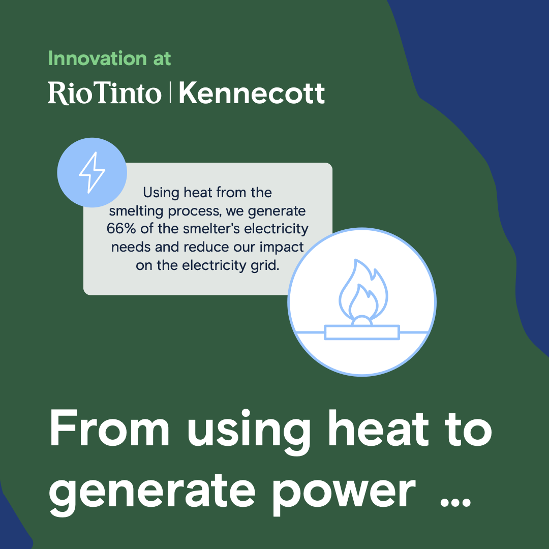
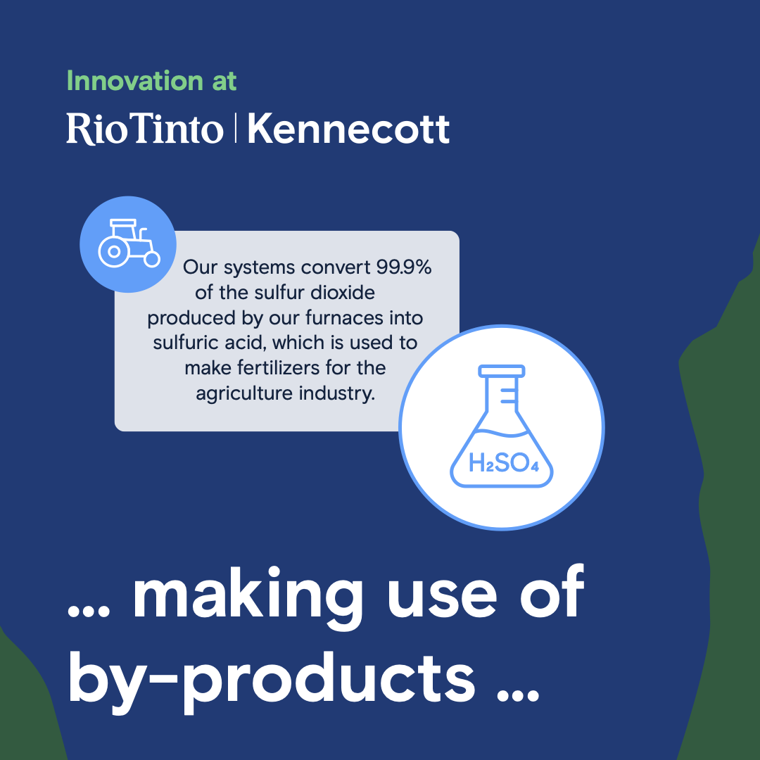
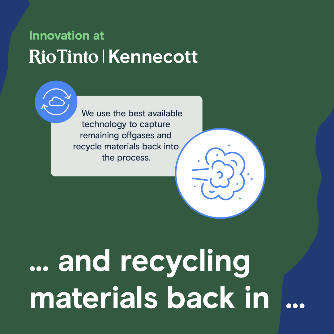
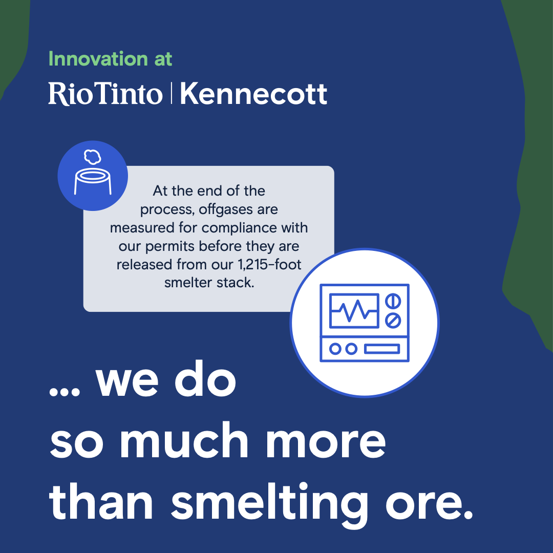
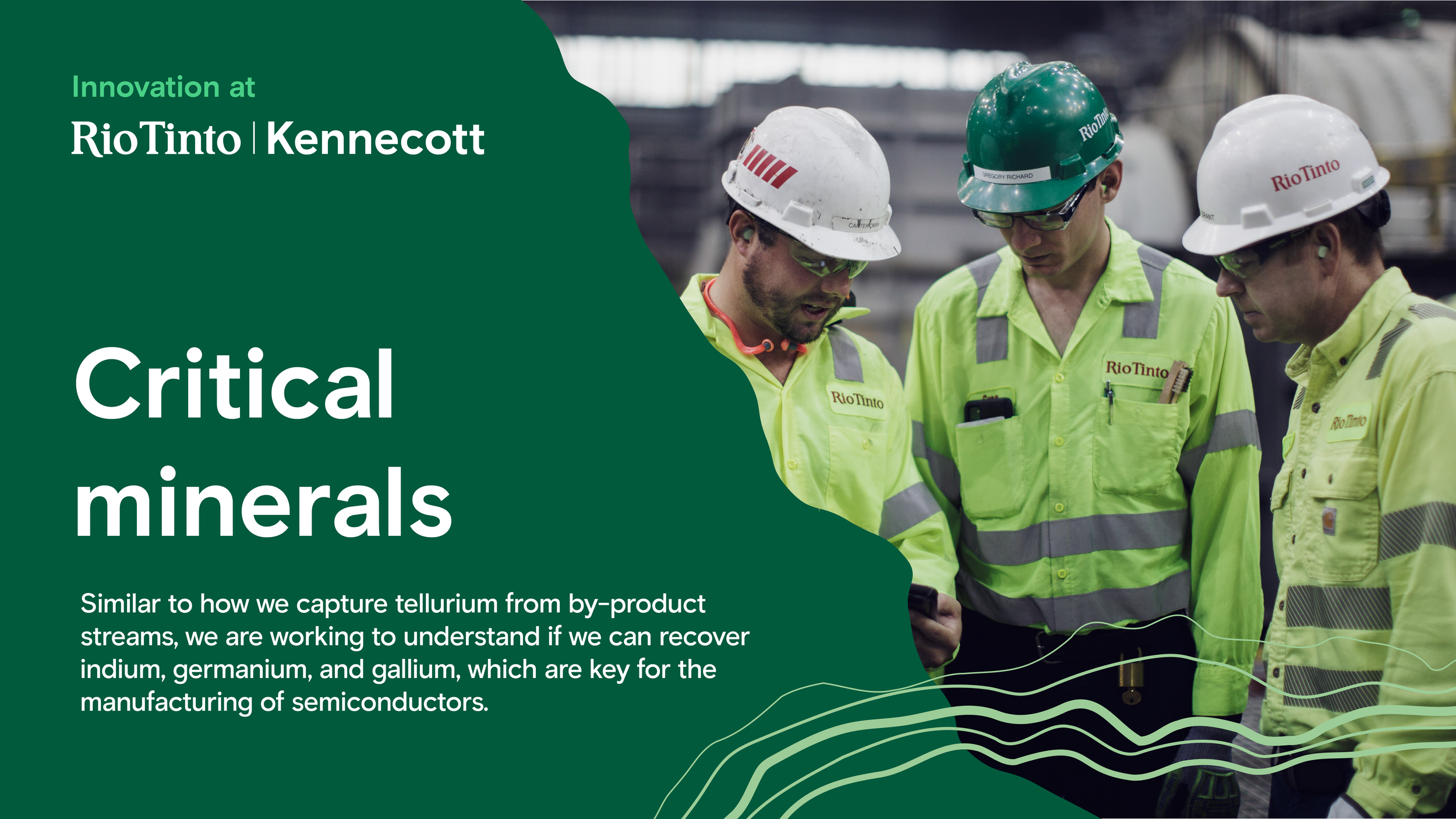
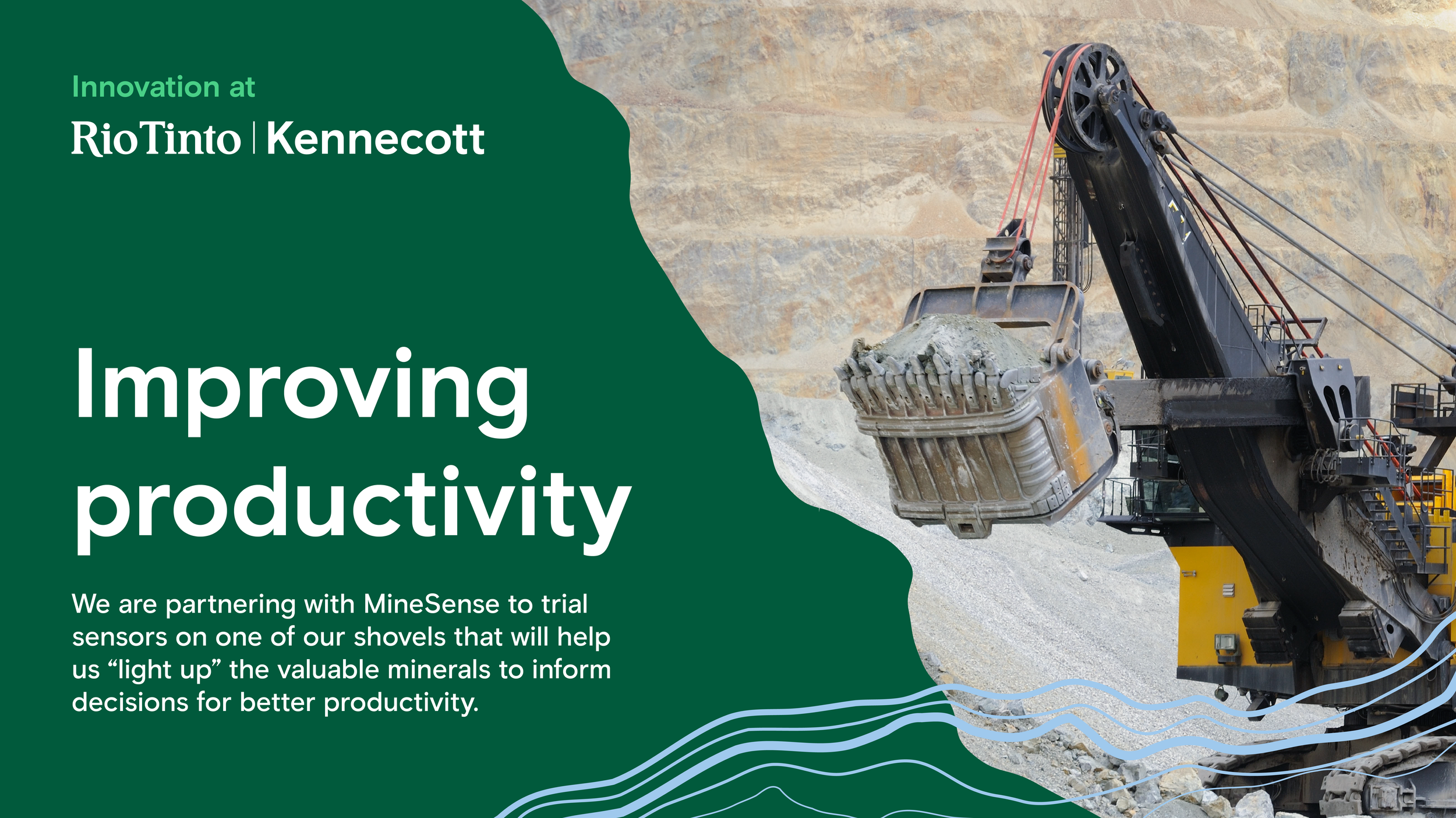
Illustrated infographics made complex programs easy to understand and share.
On-site video made the progress real, showing the ingenuity and engineering behind it.
Employee communications helped workers see the impact of their contributions.
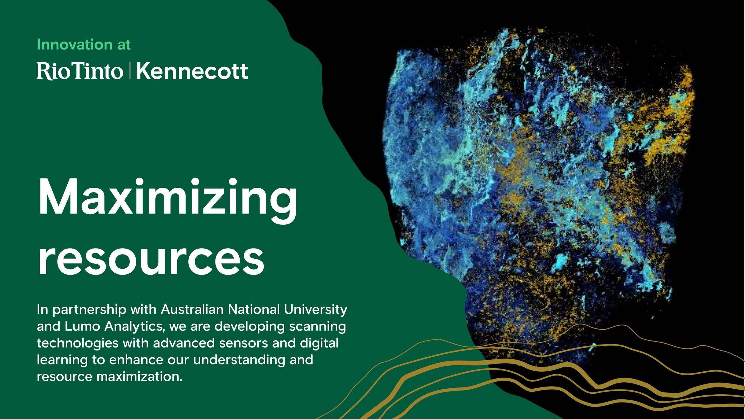
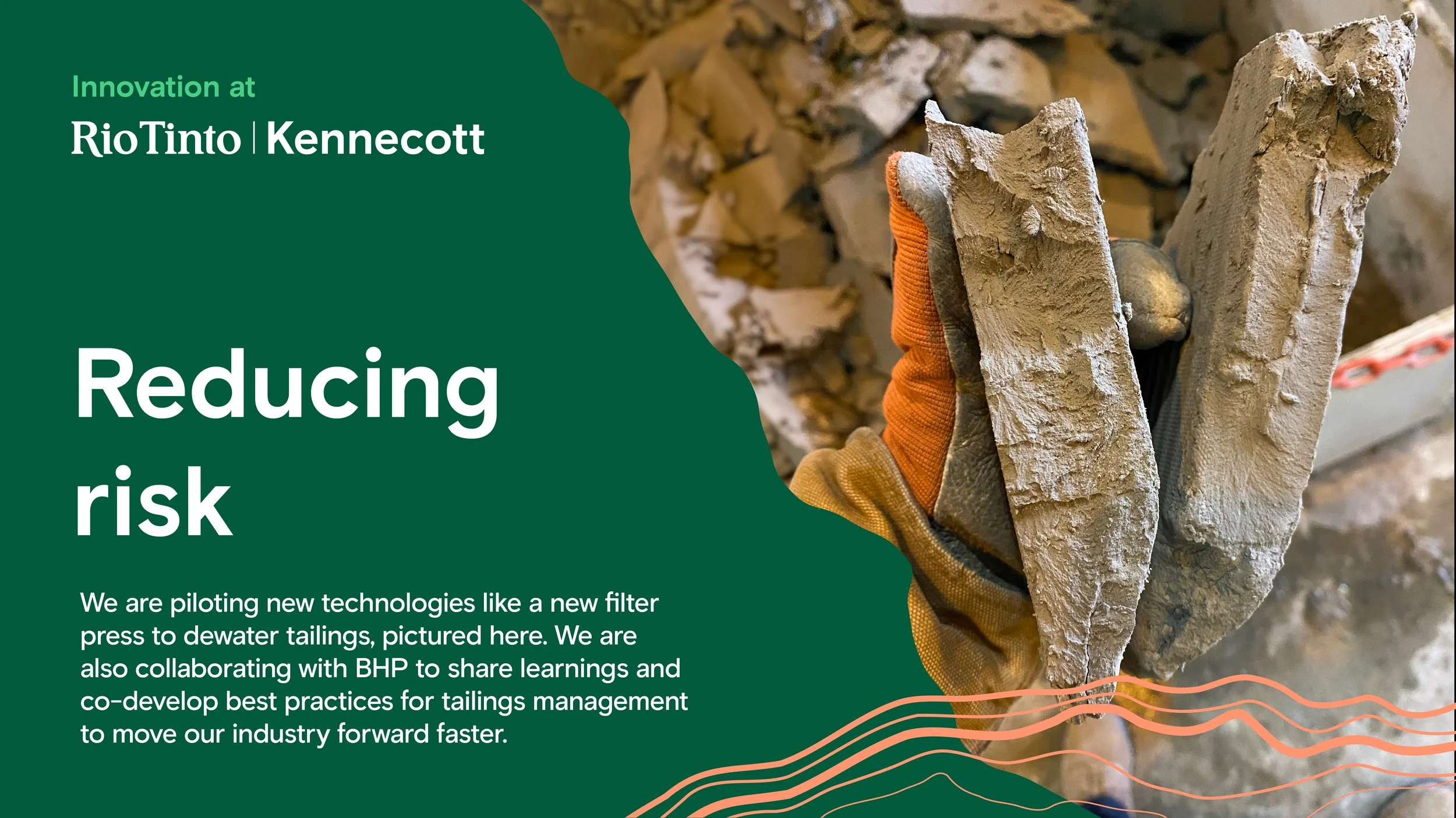
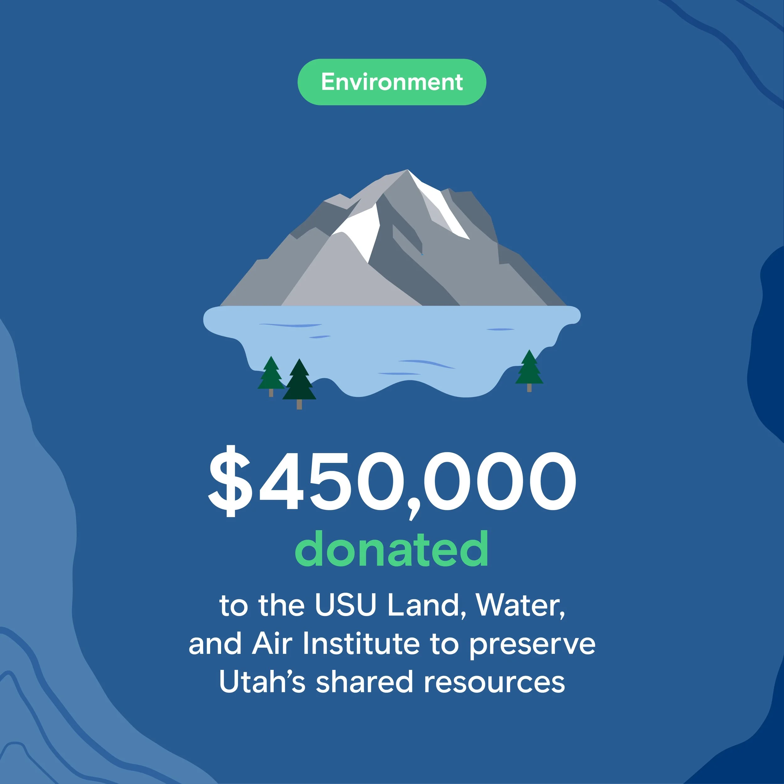
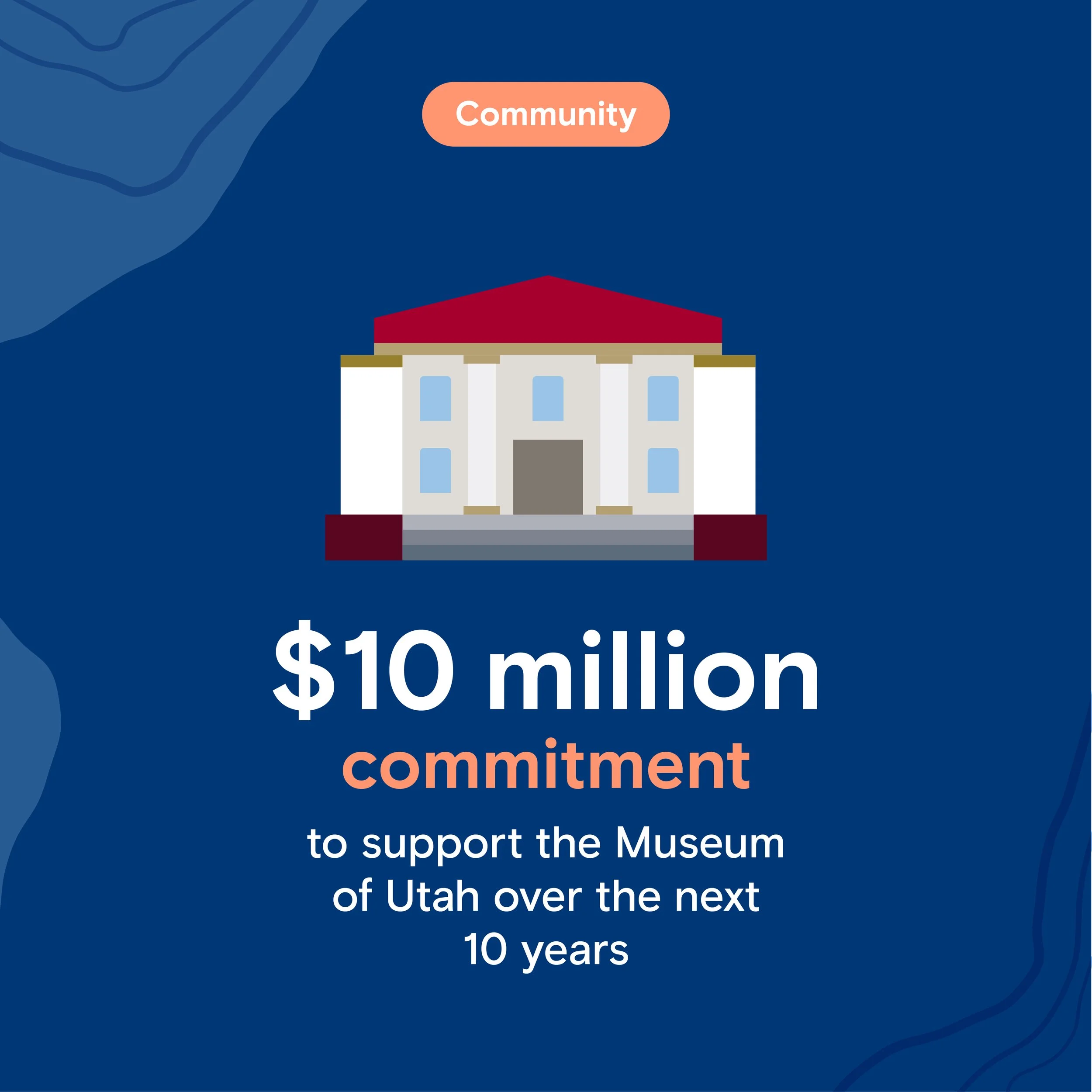
Altogether it enabled Kennecott to communicate its work to be a better neighbor.
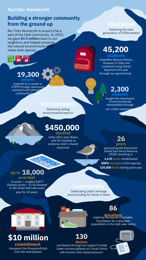
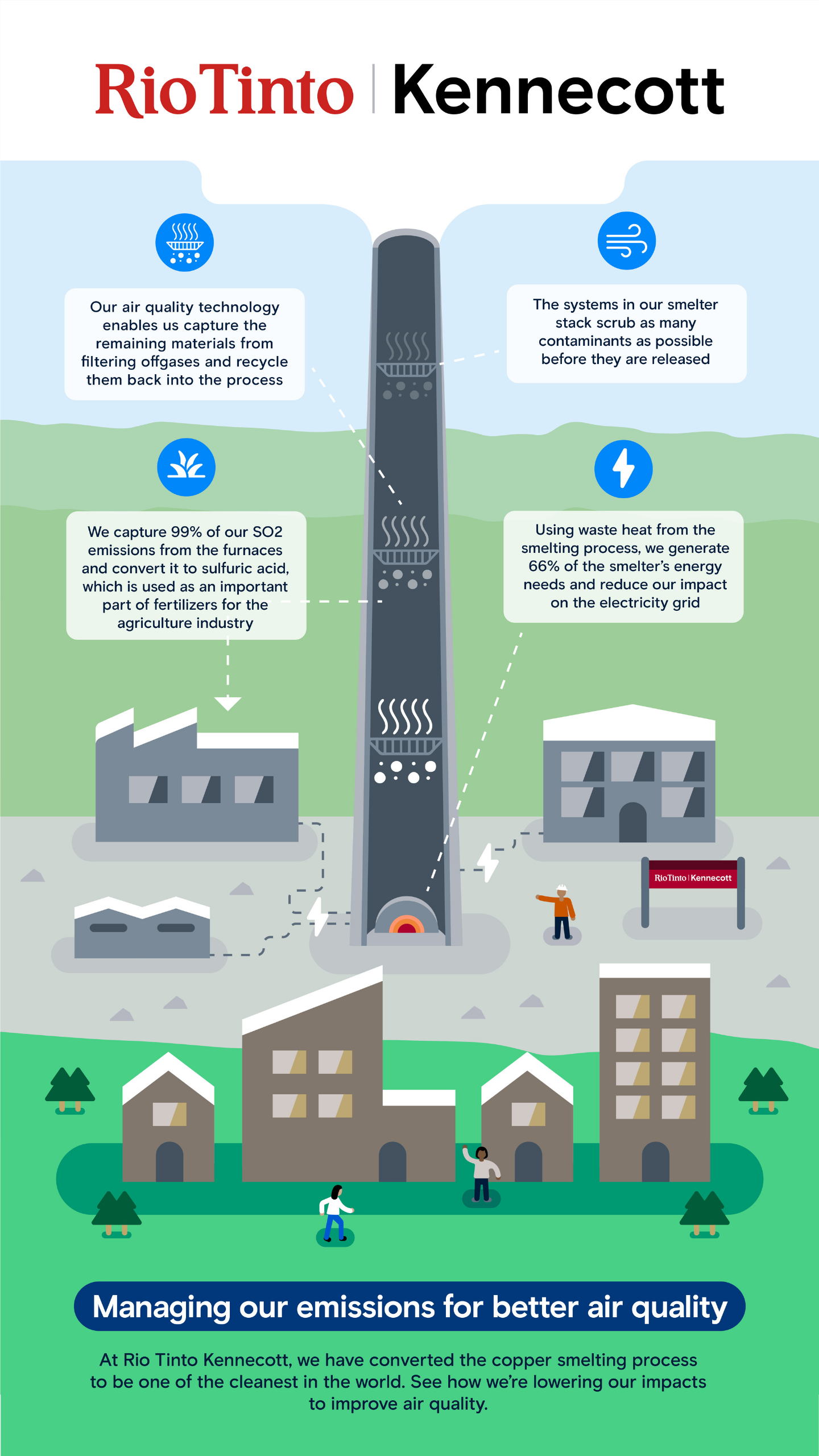
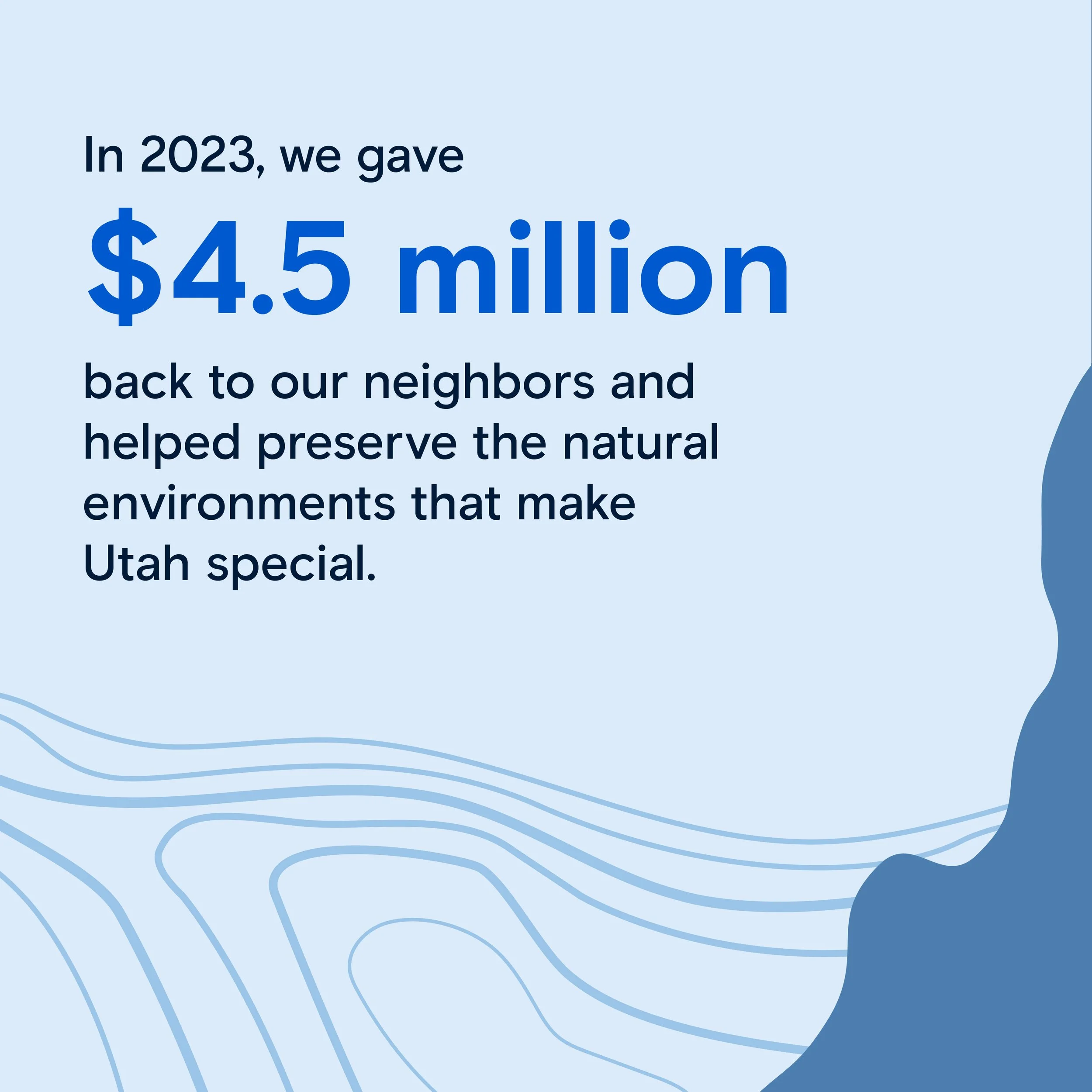
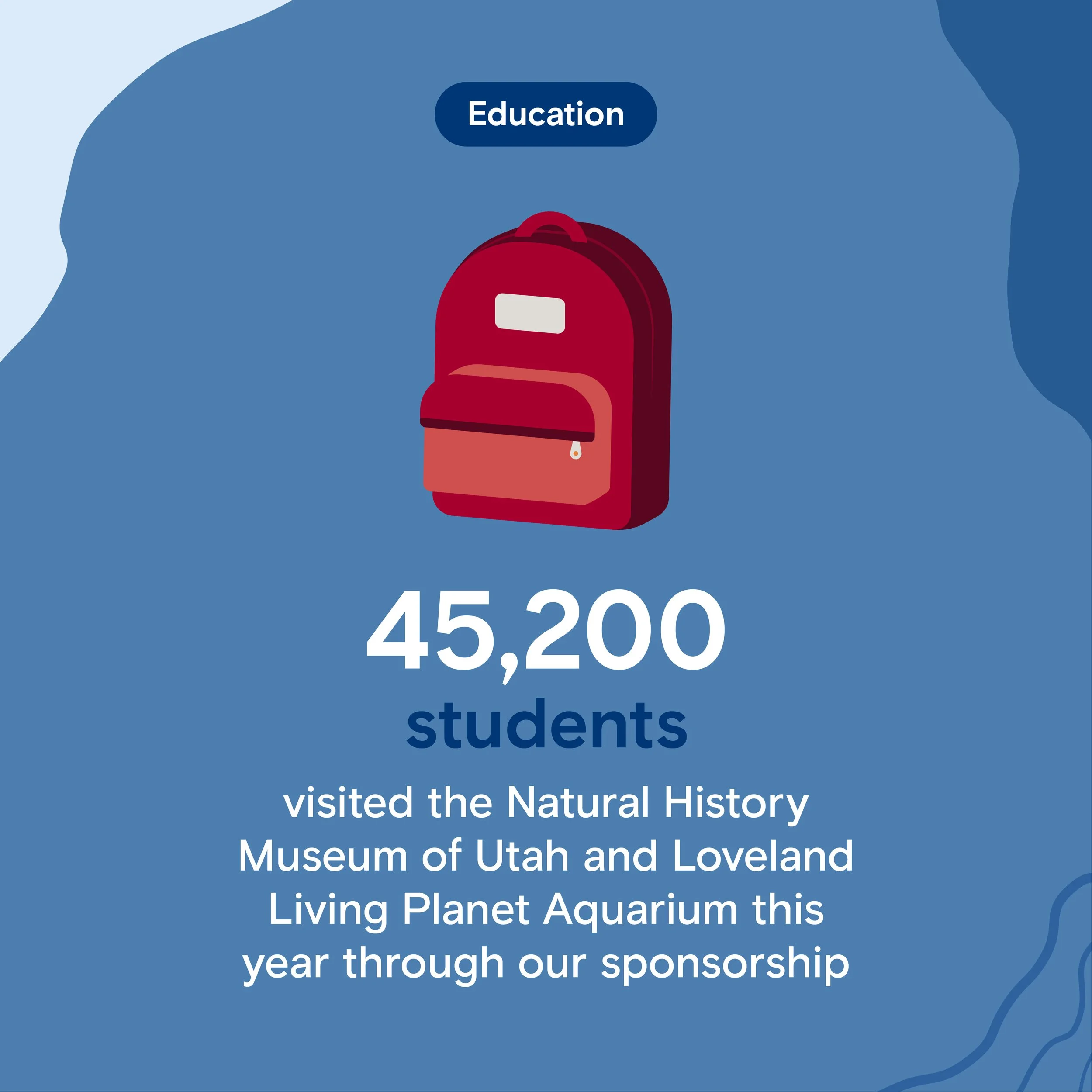
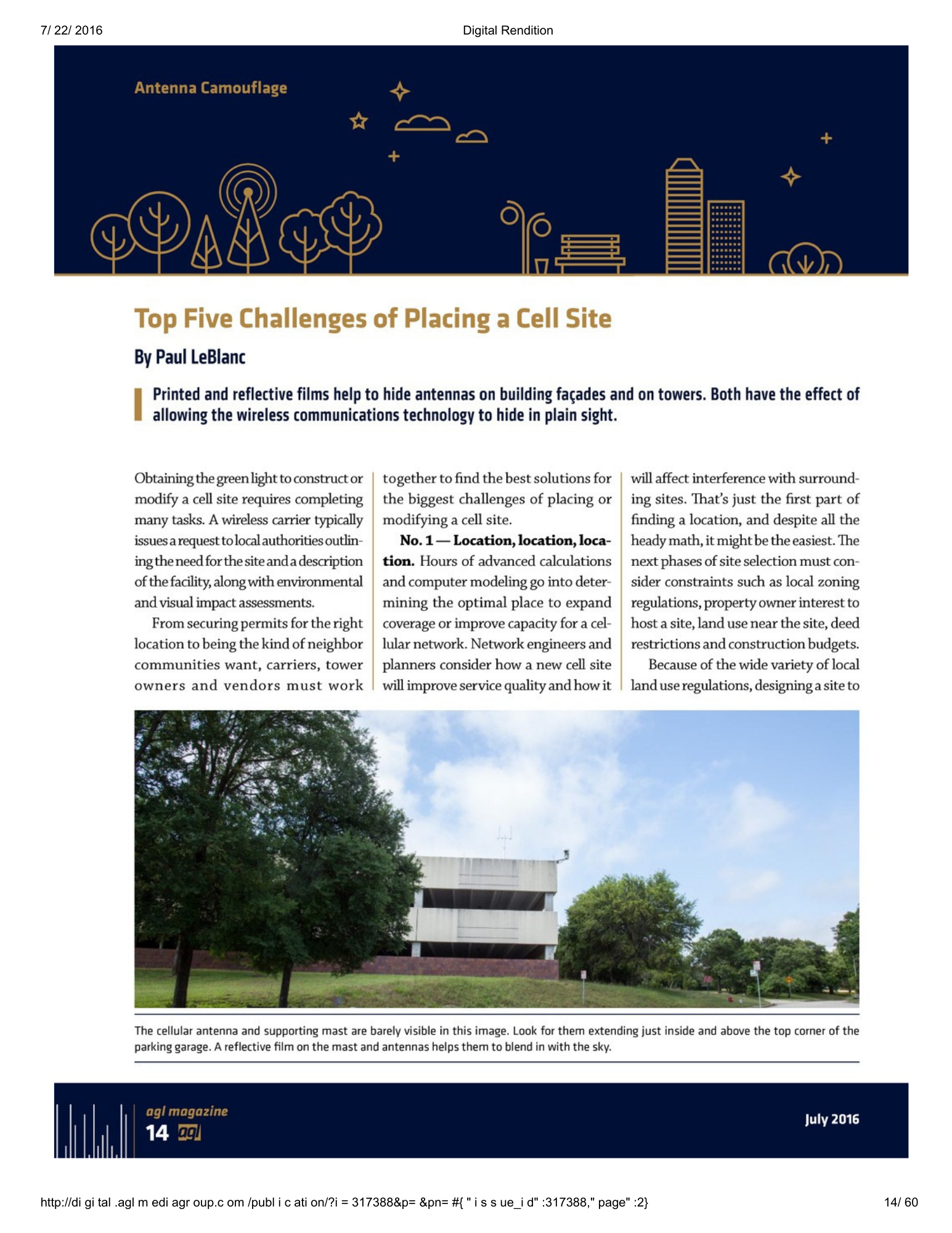
A modular story system made a big, technical narrative easier to trust. Kennecott’s story was too large for a single “brand film” or a one-page explainer. The work required editorial planning and modularity: mapping the larger narrative, breaking it into clear topics, pairing each topic with a specific proof point, and matching the format to the message. The result was a repeatable system—infographics for clarity, video for progress in action, social for continuity—that helped Kennecott communicate real progress not broad claims.
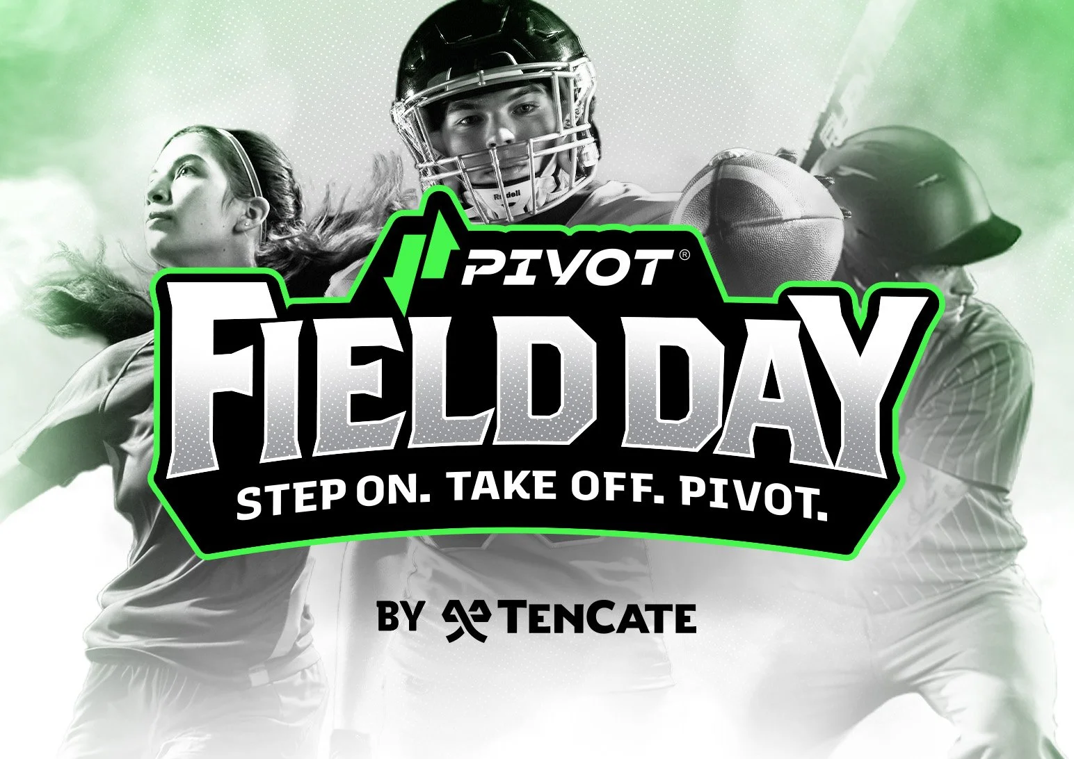
Pivot Performance Turf
Expressing the ingenuity and energy of a category shift.
Pivot Performance Turf
Product Launch
Expressing the ingenuity and energy of a category shift.
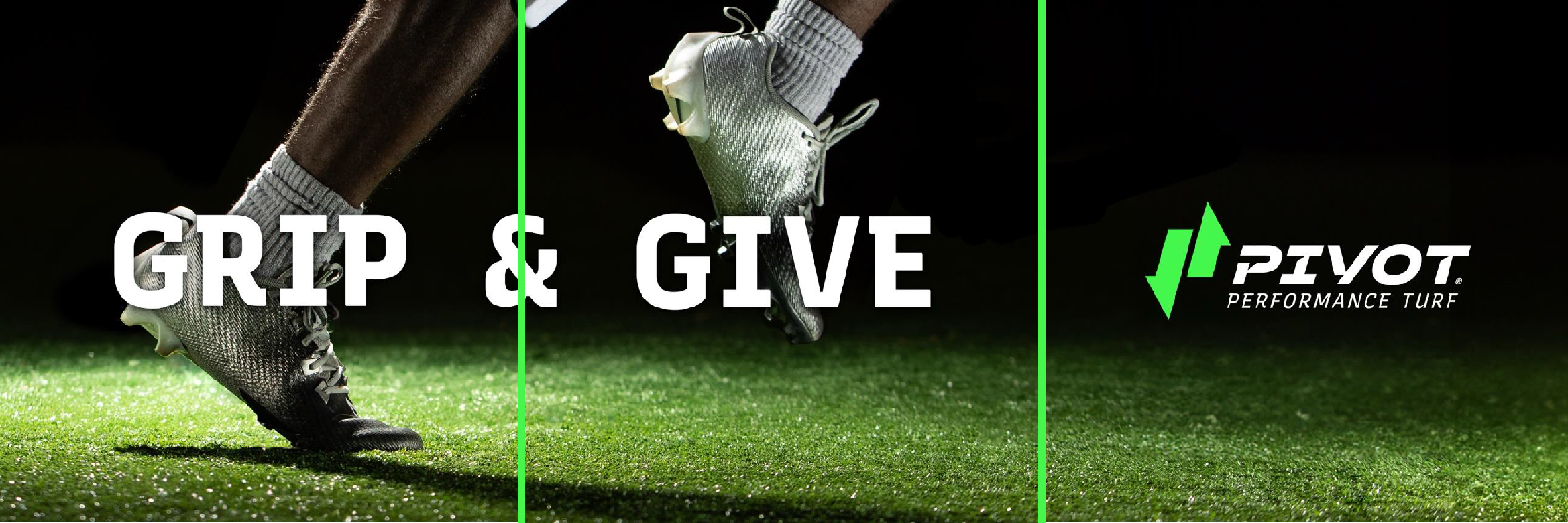
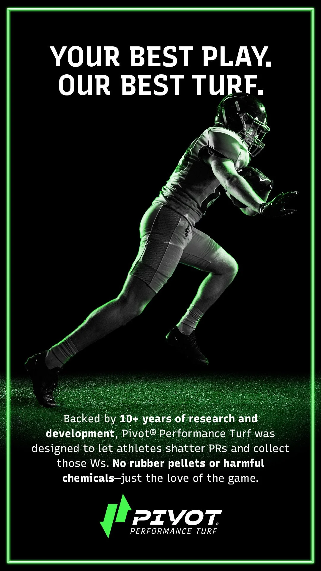
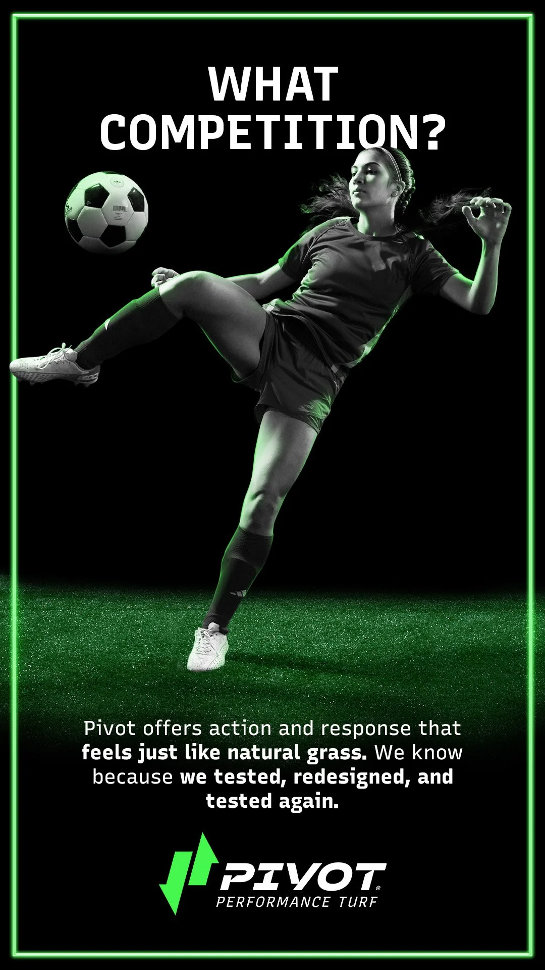
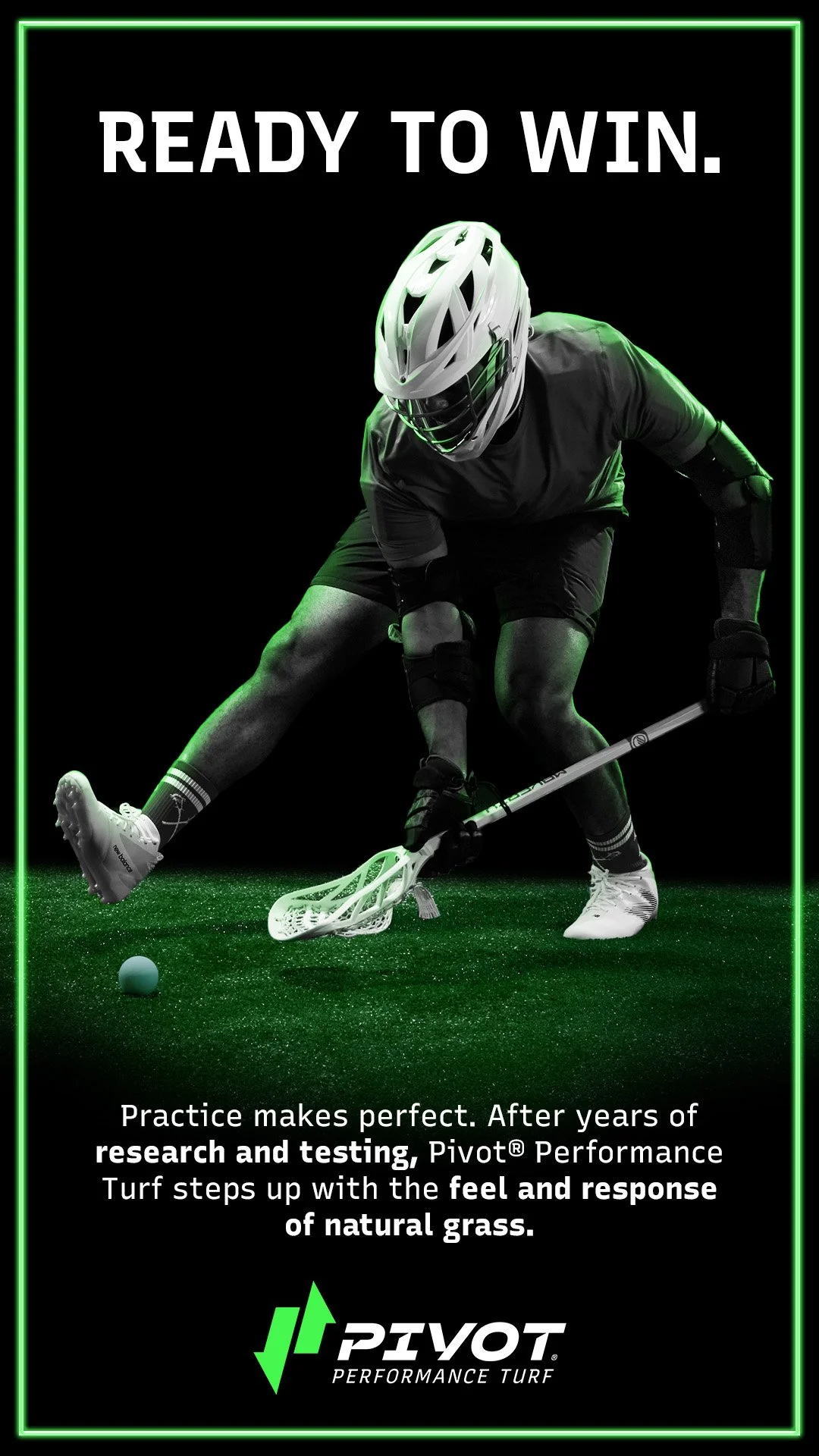
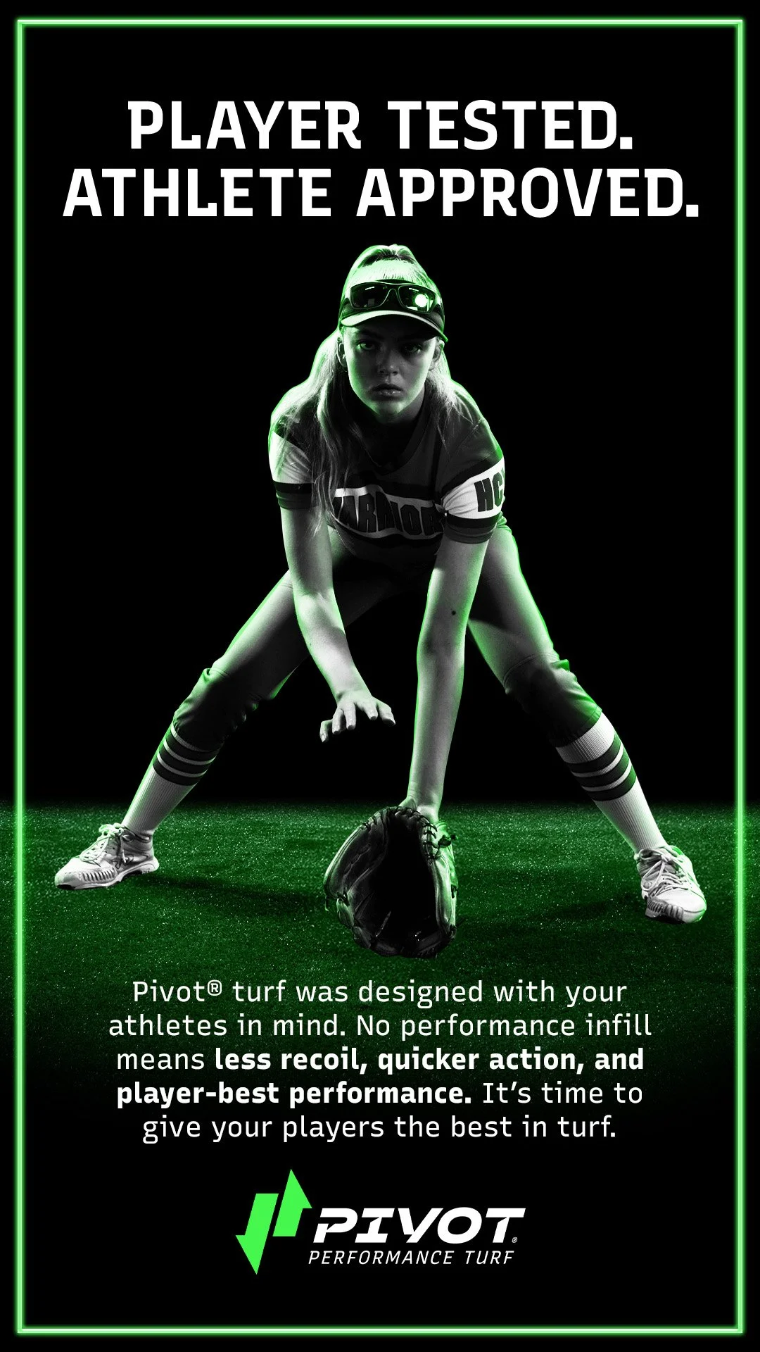
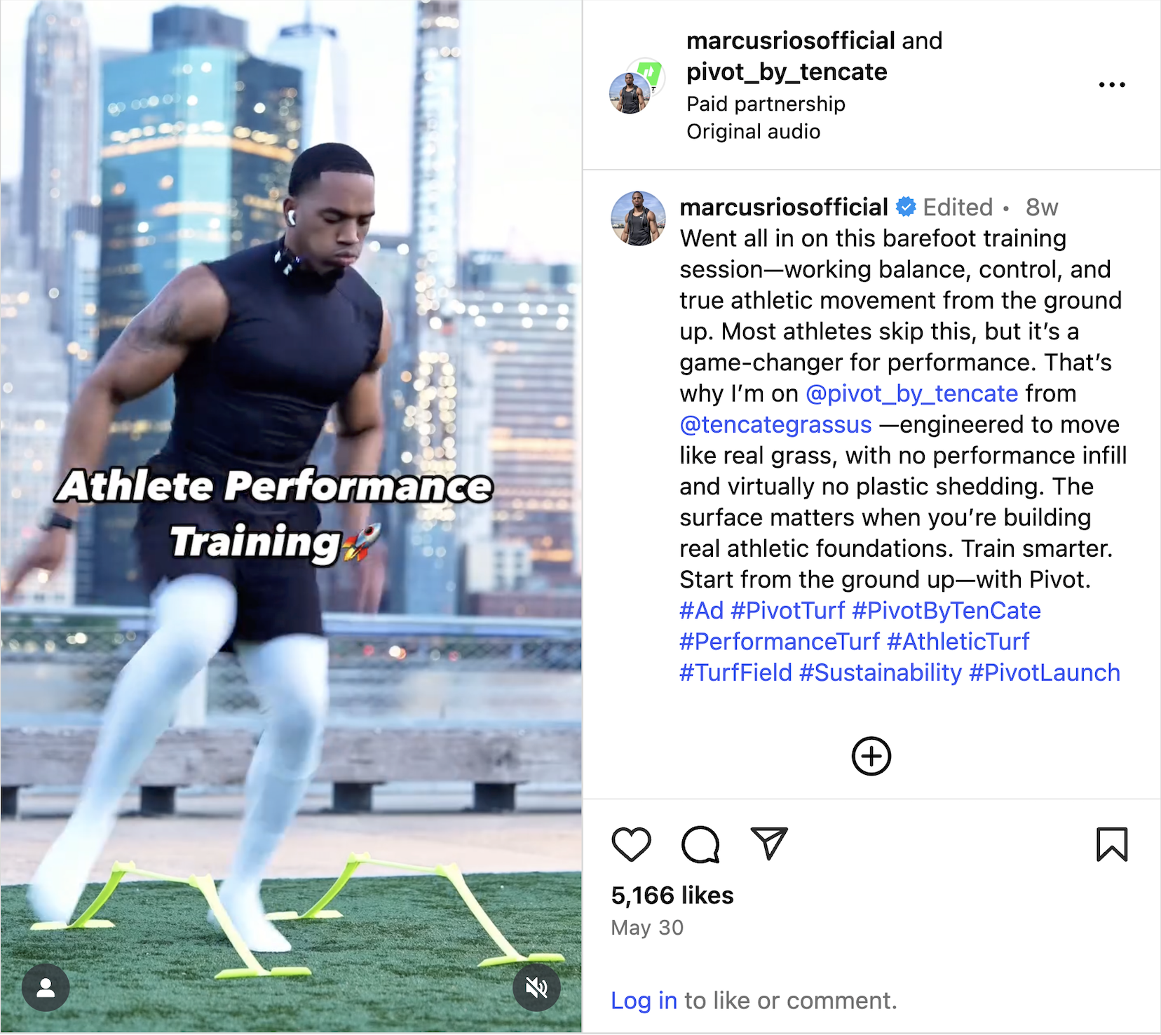
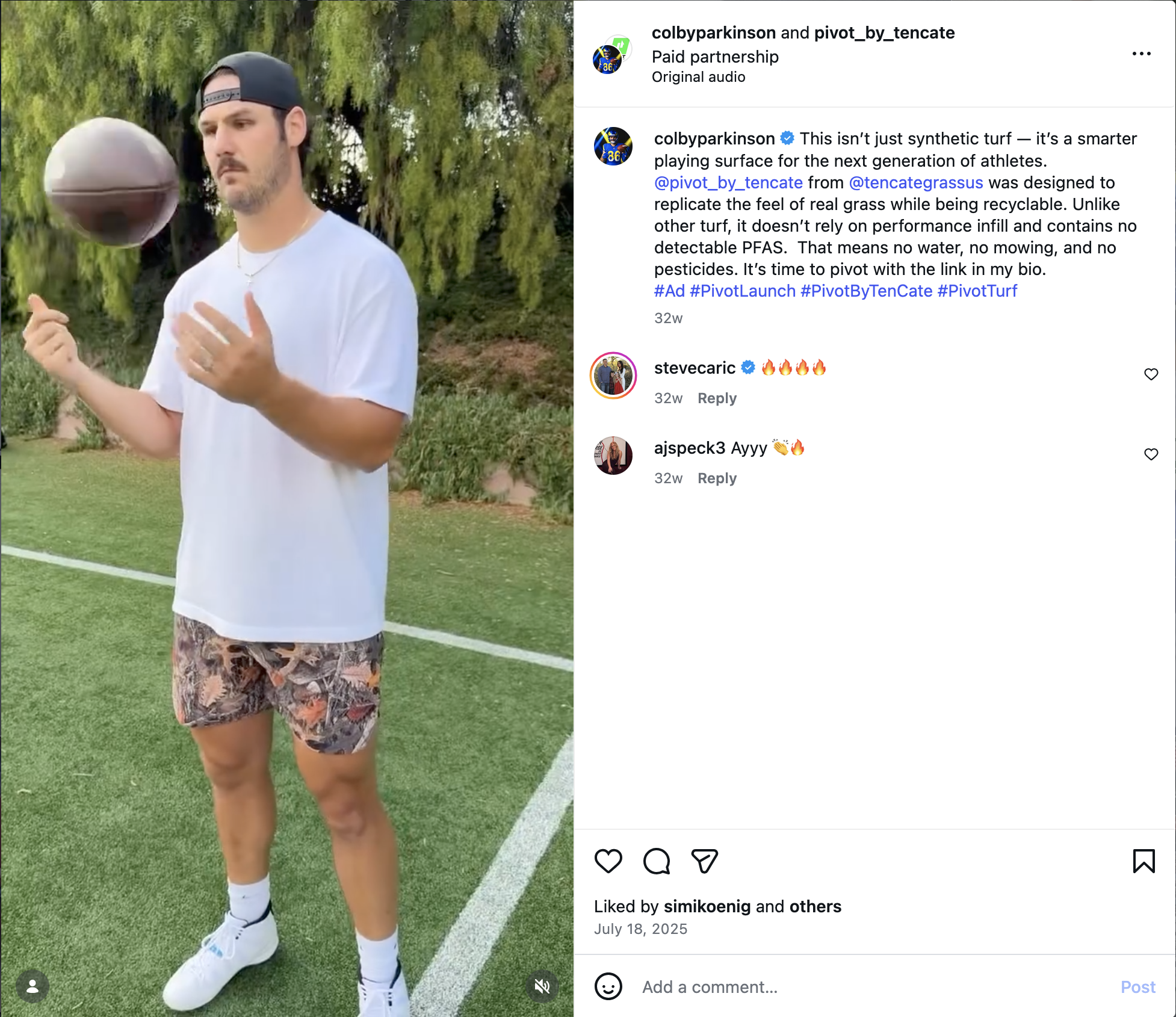
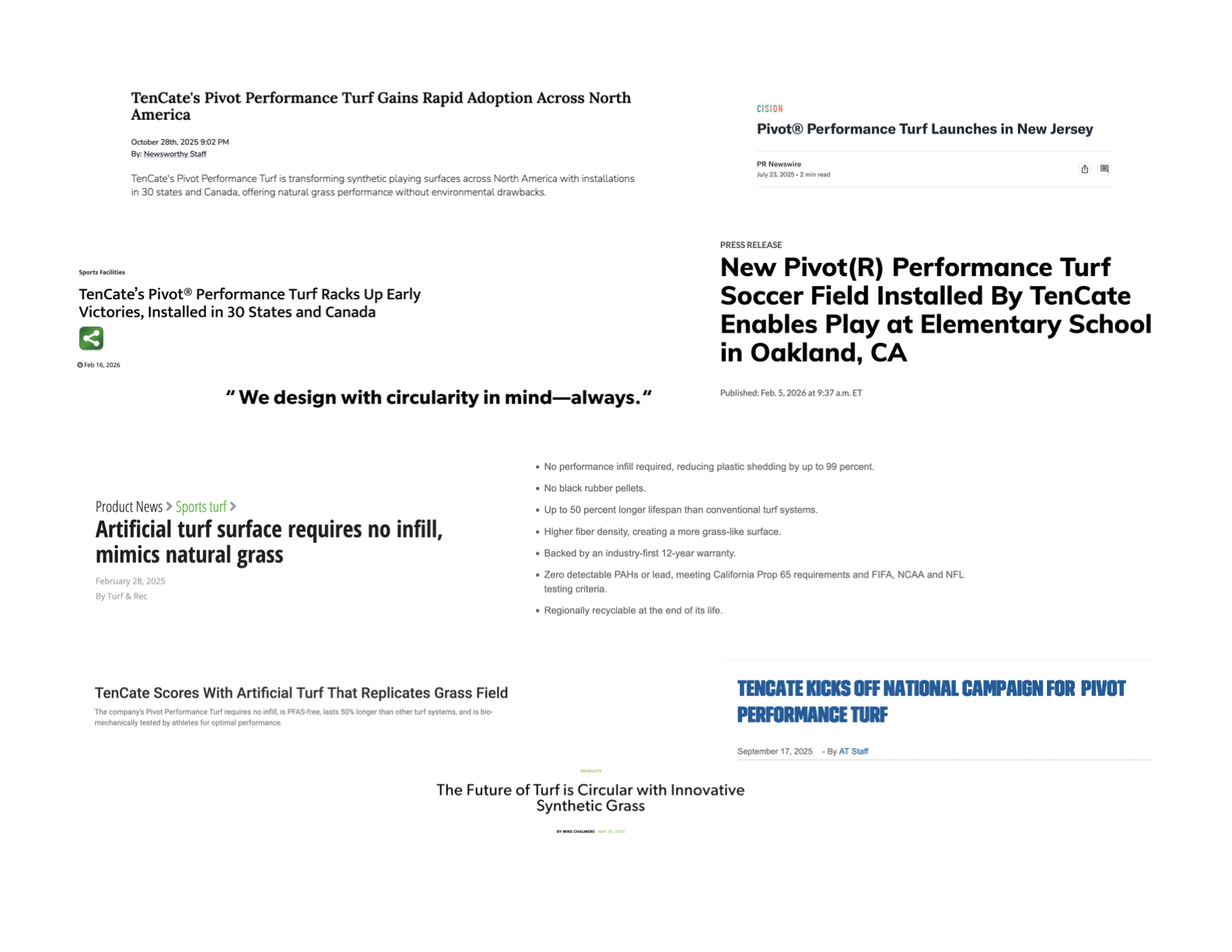
After four years of R&D and 50+ iterations, TenCate’s turf team built something materially different: no added PFAS, a no-infill system, a longest-in-category warranty, and a feel closer to natural grass. The challenge wasn’t making noise—it was making the difference legible to buyers who already thought they’d “seen turf.”
We started with the right name: simple, ownable, and performance-forward.
We made the product difference visible through craft: macro imagery and clear product storytelling.
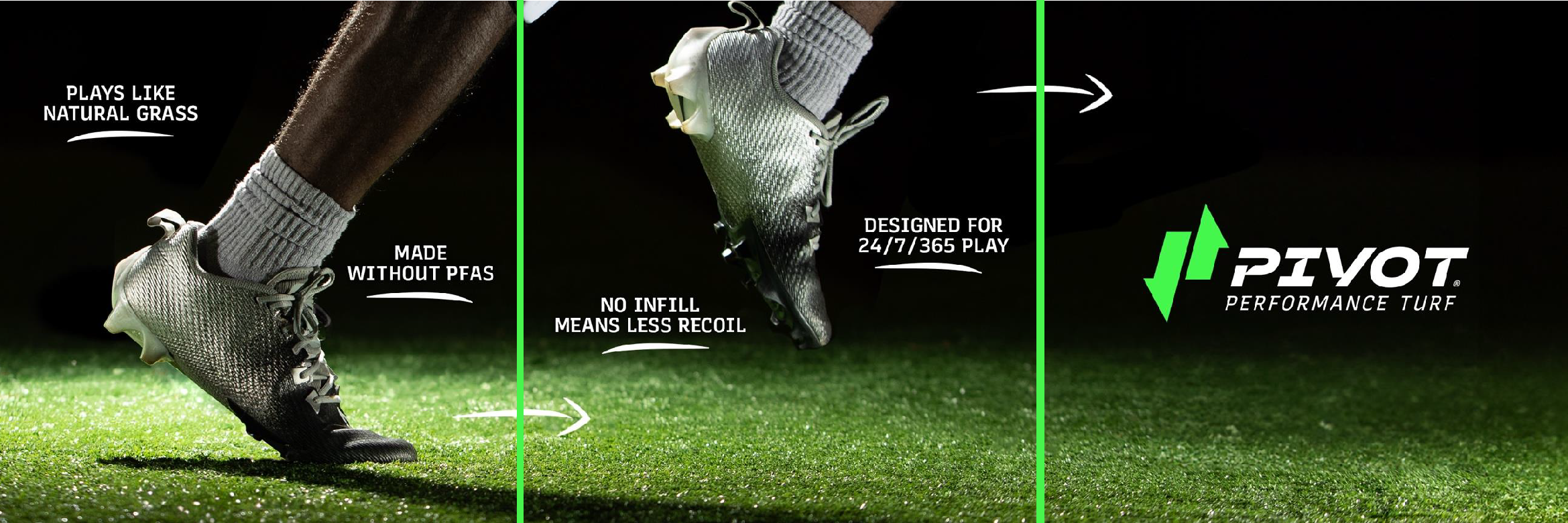
We framed the story athlete-first: performance and feel, not industry jargon.
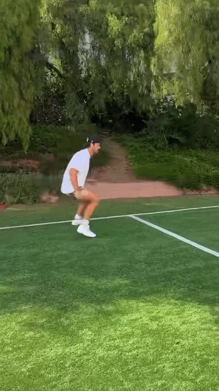
We kept momentum up as adoption grew: video, influencers, events, and rapid-response content tied to industry news.

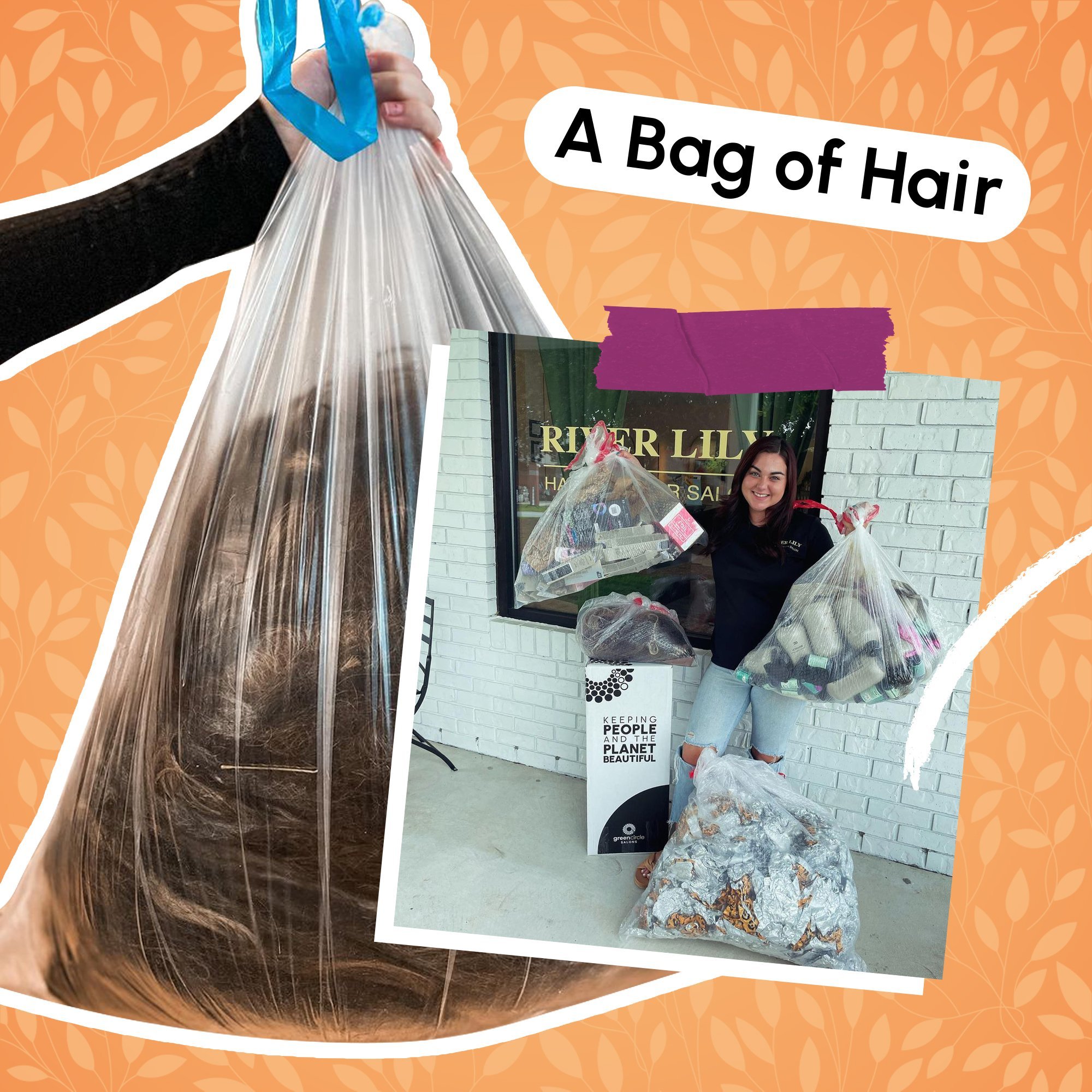
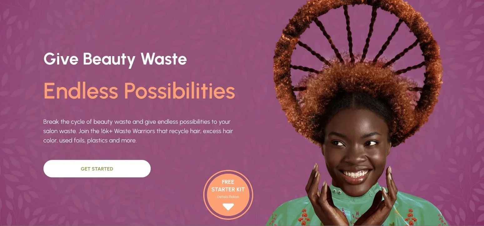
Green Circle Salons
Shifting perspectives from beauty waste to a valuable (and fun) resource.
Green Circle
Salons
Endless Possibilities campaign
Shifting perspectives from beauty waste to a valuable (and fun) resource.
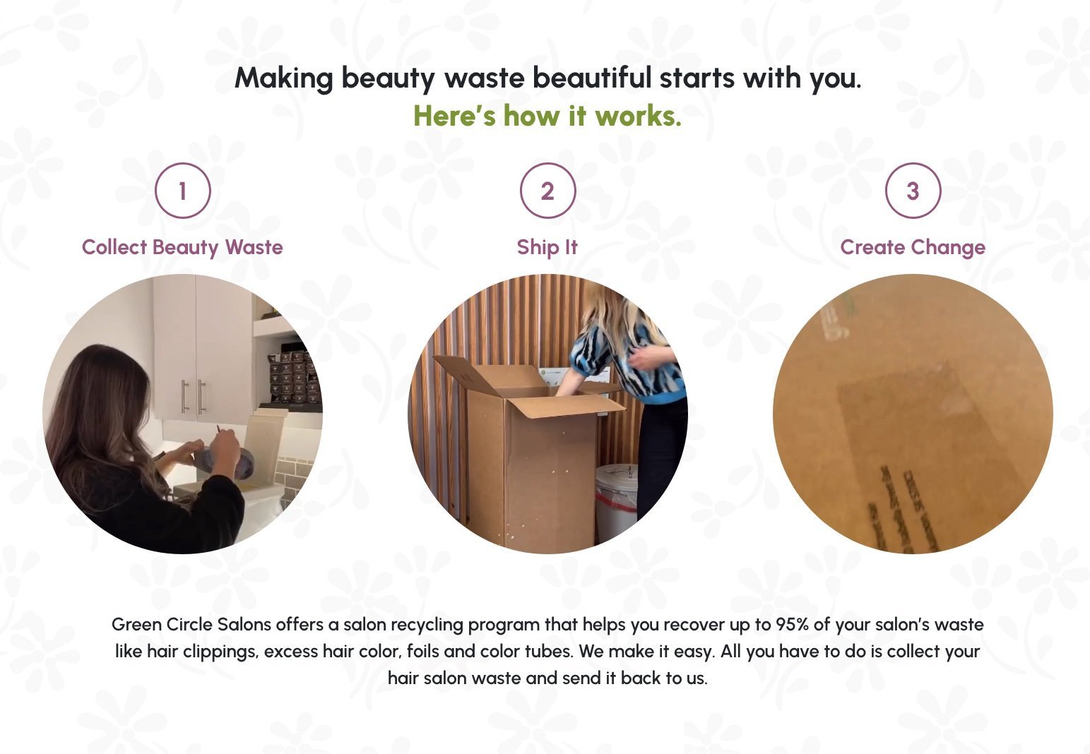
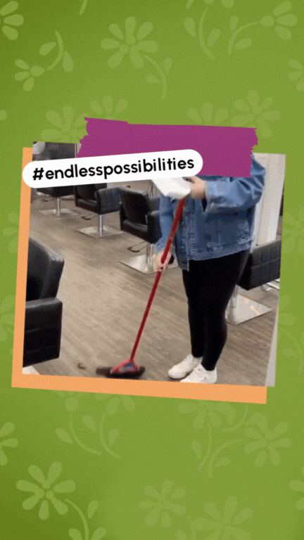
Green Circle recovers beauty waste and diverts it into recycling streams. The service worked, but the message wasn't landing with salon owners and stylists. The breakthrough was treating waste as creative potential.
Start the conversation in their language.


Make the leap from waste to possibility.


Put the idea in their hands.
Show how it works.
Celebrate their wins.
We built a campaign system that carried one story across paid and organic social, influencer collaboration, and industry placements. Social content established the why (impact and identity), while the landing page delivered the how (service explanation) alongside lead capture. The result: we surpassed our lead-gen KPI and built a pipeline of beauty professionals by turning sustainability into an identity-forward narrative people wanted to join.
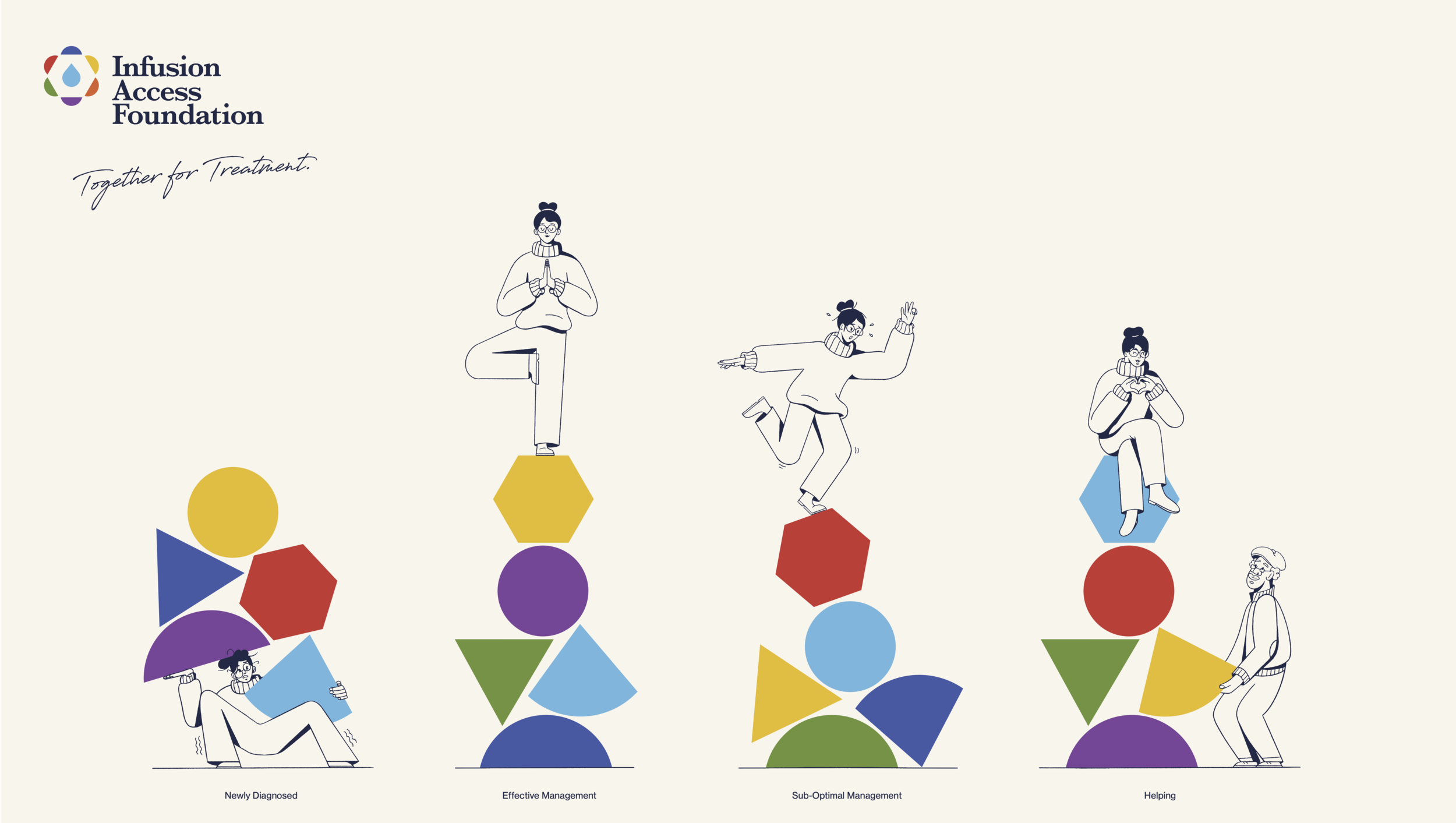
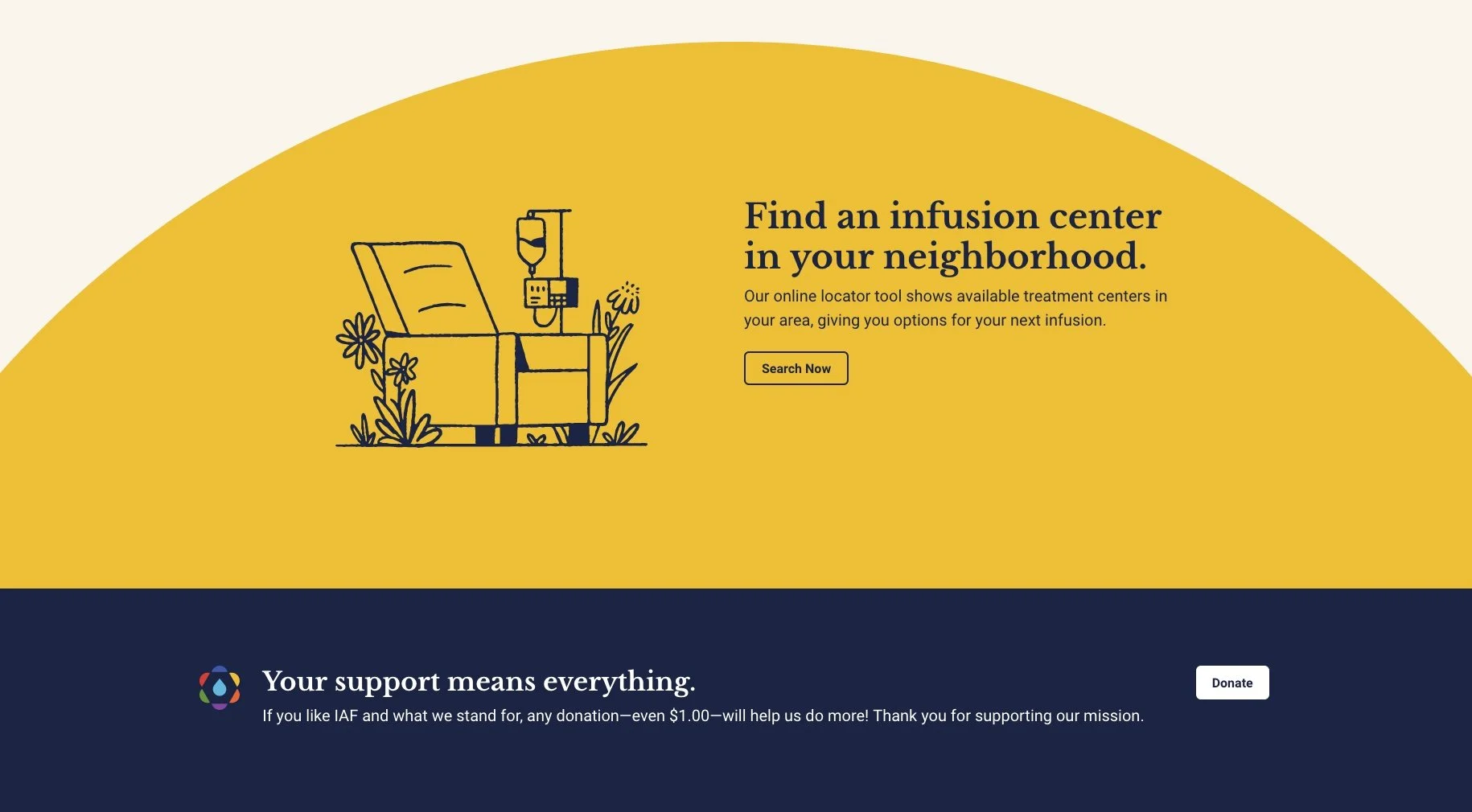
Infusion Access Foundation
A strong identity for a mission that deserves empathy, support and access.
Infusion Access
Foundation
Rebrand + voice system
A refreshed identity for a community that deserves empathy, support and access.
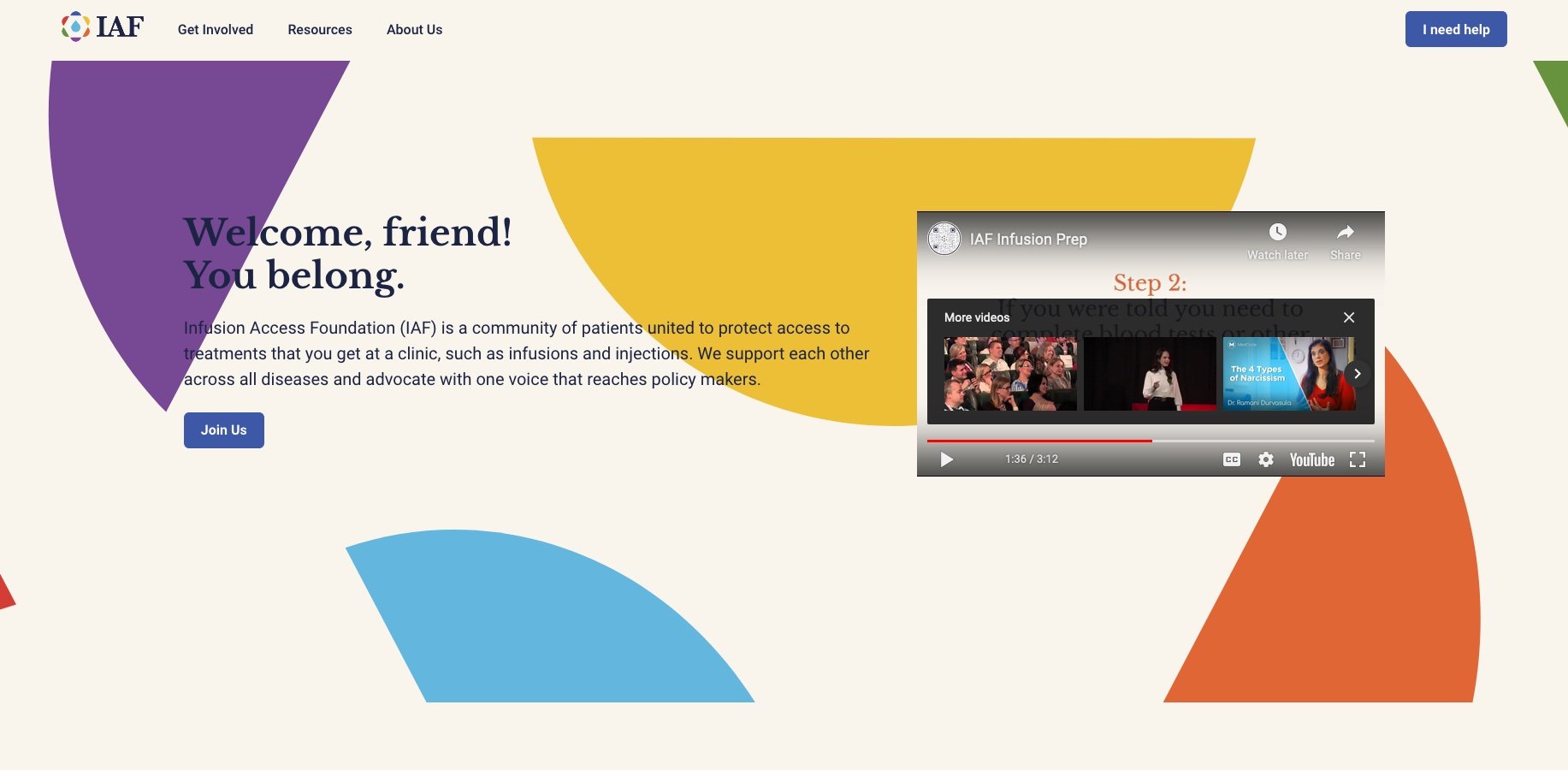
IAF supports people who rely on infusion therapy—patients and caregivers living with ongoing logistical and emotional strain. They brought us in to reimagine how the organization presents itself so it could do its work better: build community, reduce friction, and speak with enough credibility to influence partners, stakeholders, and policymakers. The rebrand needed warmth without softness.
When you’re fighting uphill for your health, it’s hard to do it alone.
It’s easier to move forward with people who understand the stakes.
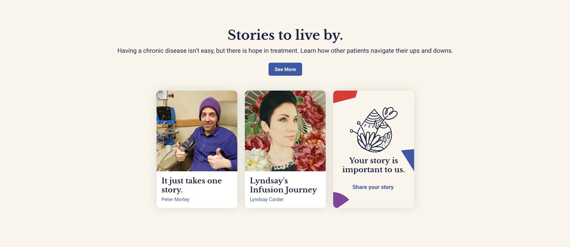
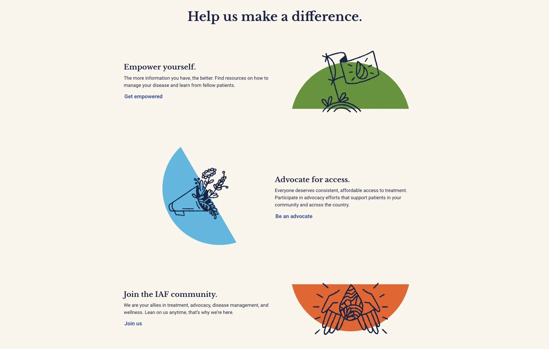
With community that reduces isolation. And resources that reduce friction.
With a shared voice strong enough to protect access to essential treatment.

Together, the fight becomes easier to navigate and win.
We built the rebrand on two requirements: empathy for people living the experience, and credibility with the people positioned to change outcomes. The voice and visual system were designed to steady an overwhelmed audience—clear language, restrained tone, and a sense of understanding without sentimentality. The result was a sharper articulation of IAF’s purpose, stronger community-building messaging, and a narrative foundation that can scale from patient support to stakeholder and policymaker influence.
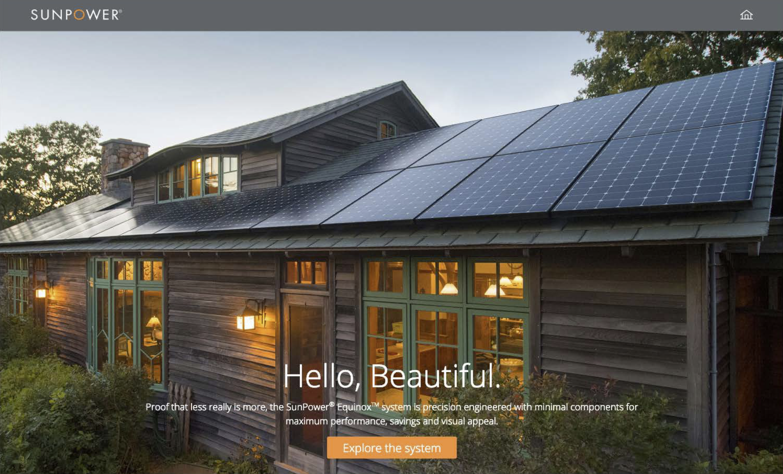
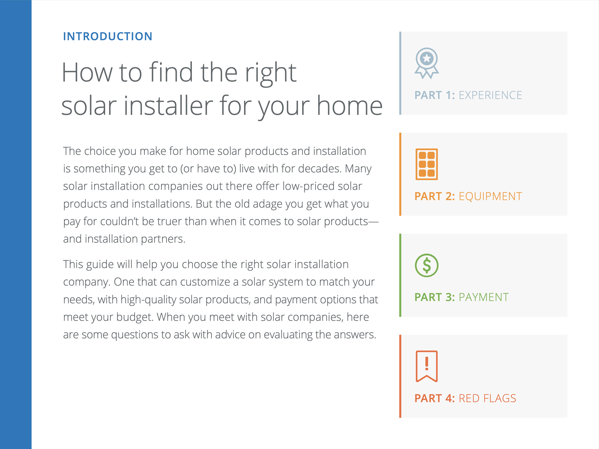
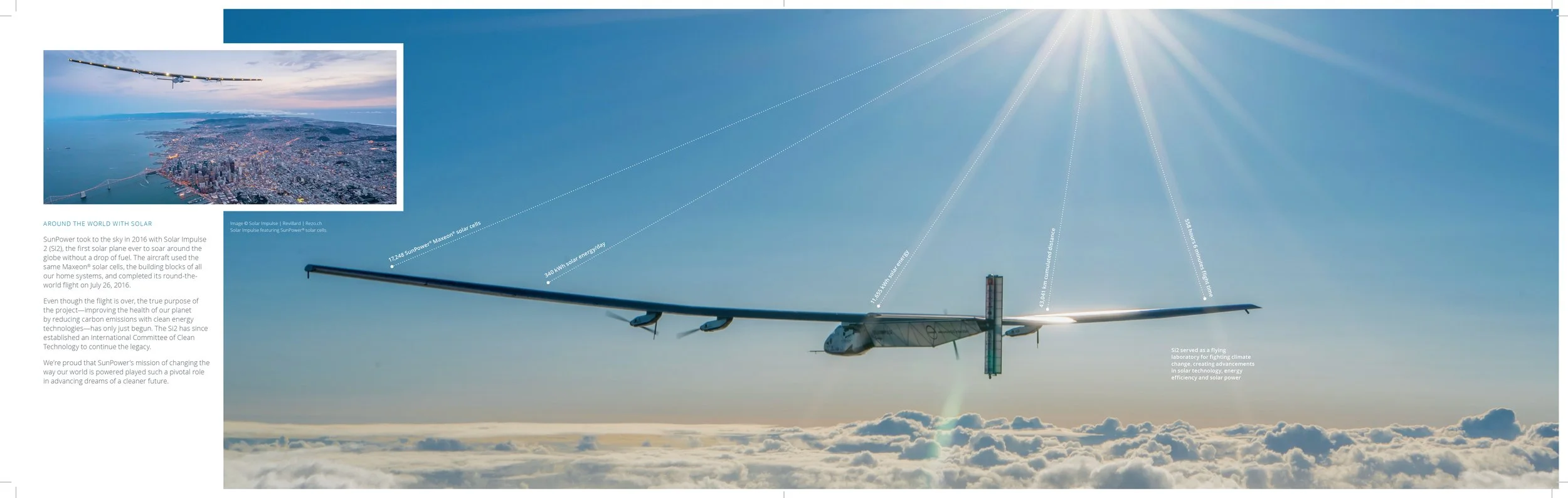
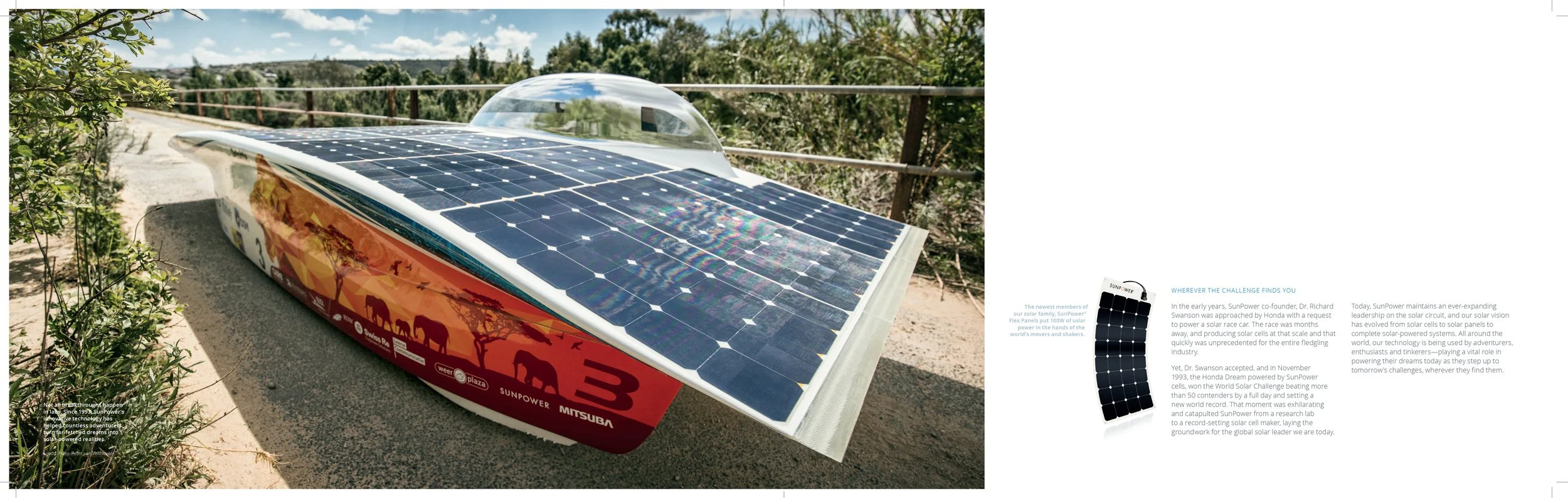
SunPower Solar
Supporting a complex decision journey.
SunPower Solar
Product narrative system
Supporting a complex decision journey.
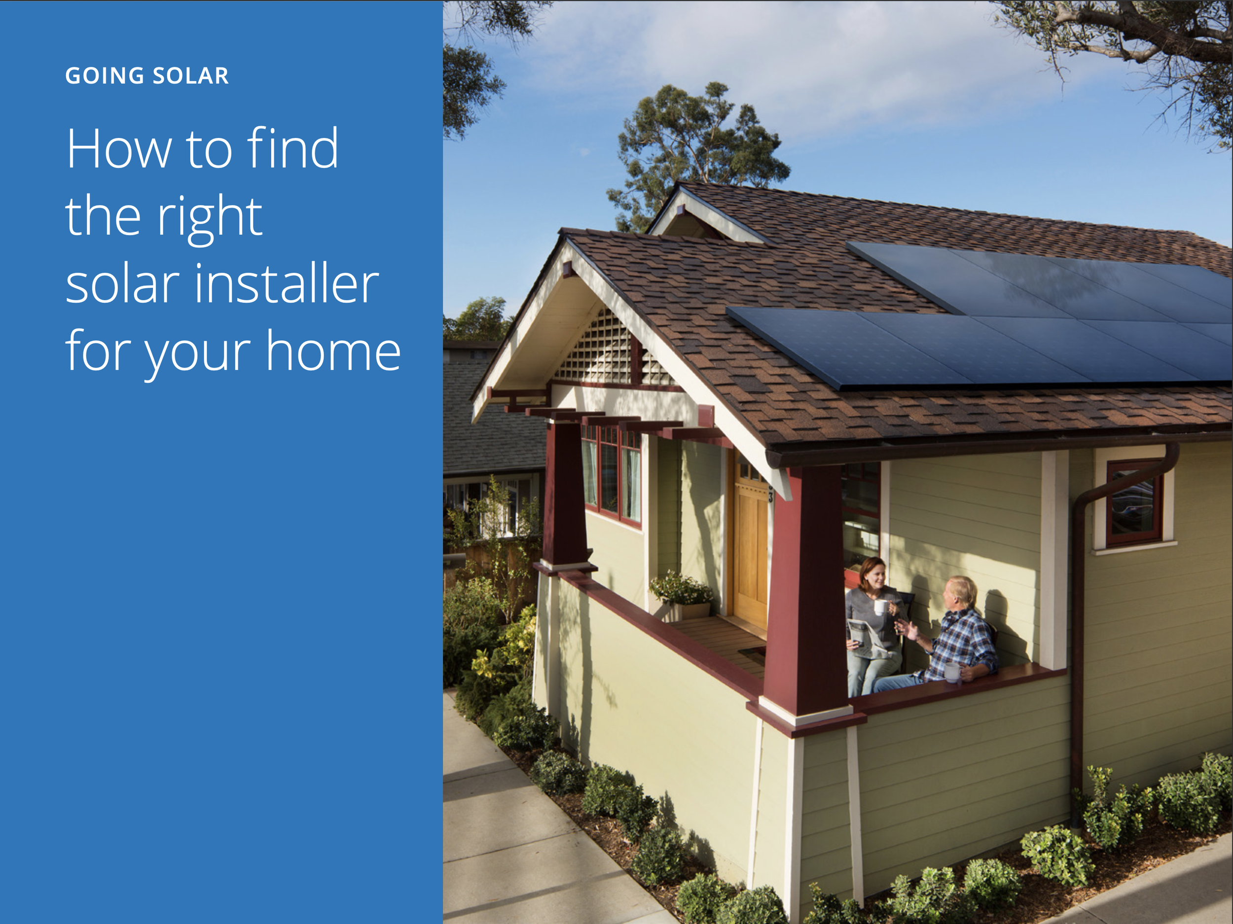
Solar is a major home purchase—and SunPower is often the premium option. The journey had to anticipate hesitation (cost, installation uncertainty, performance, long-term value) and reduce friction early. The good news: we had proof. SunPower’s technology, aesthetics, and warranty gave us clear advantages to translate into confidence-building content that supported sales.
An interactive tour let customers explore the system hands-on.
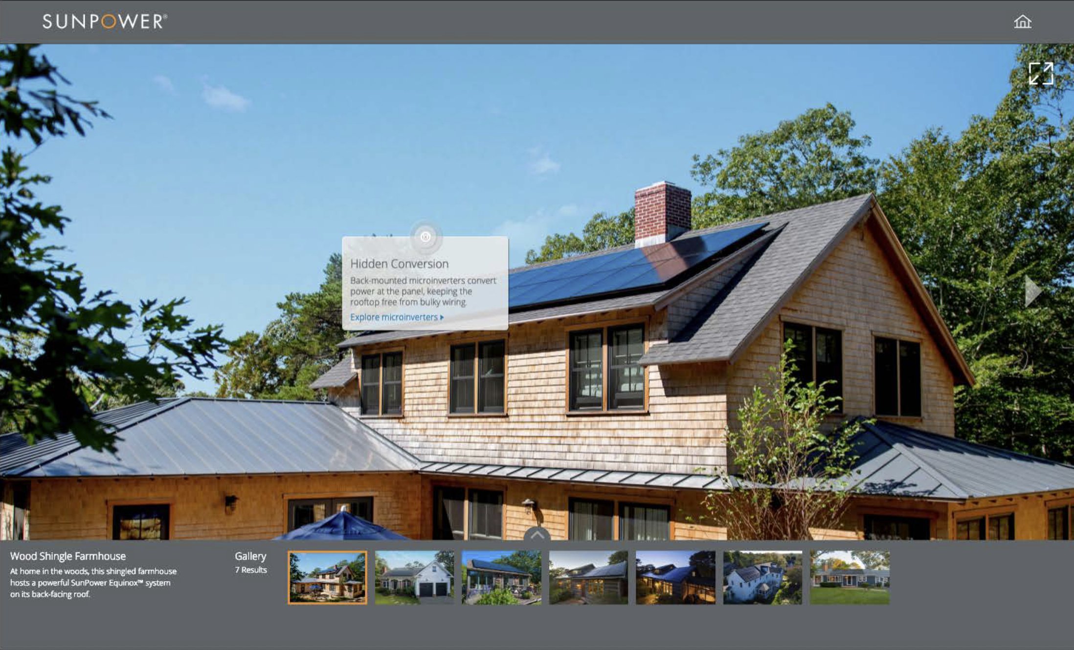
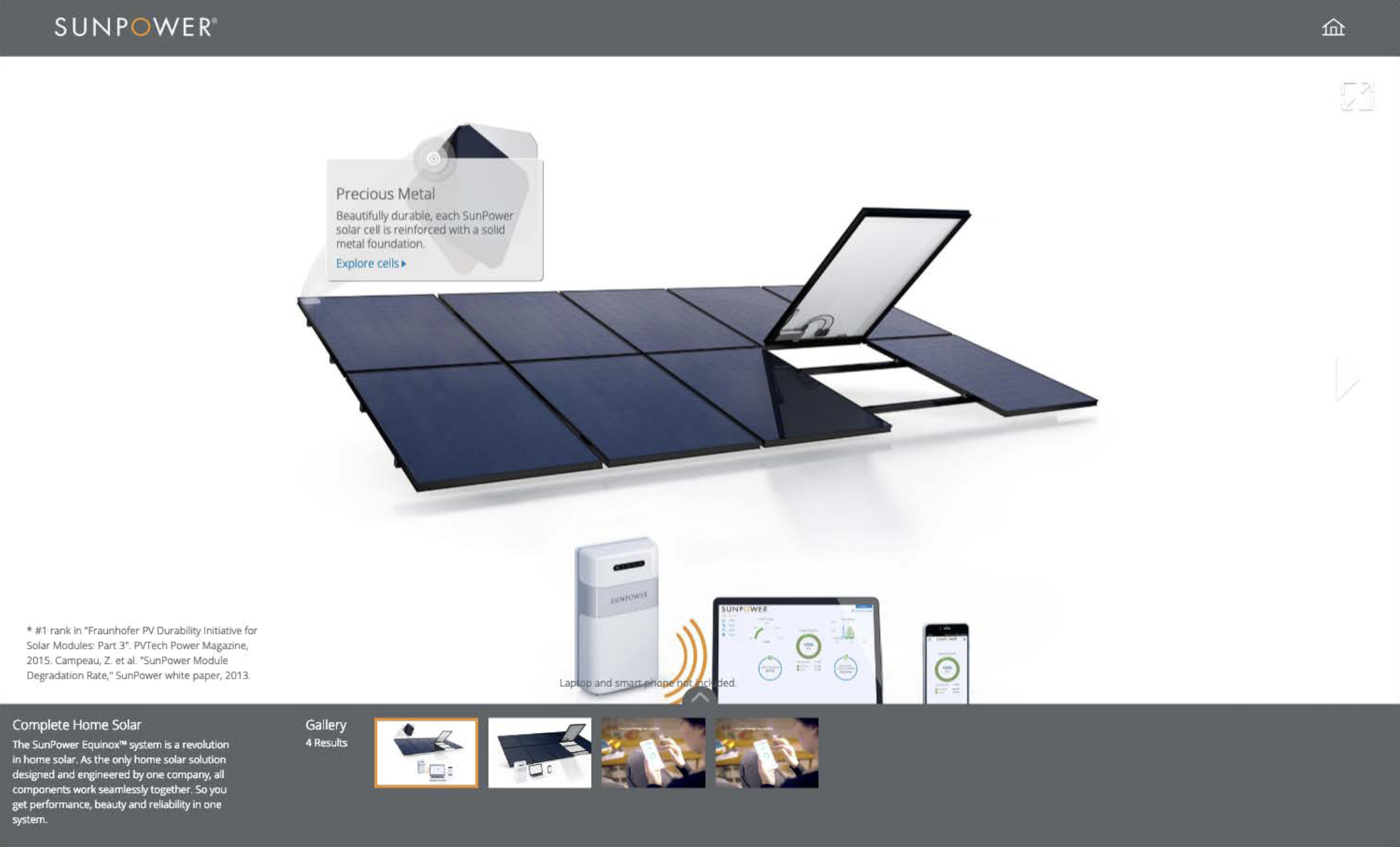
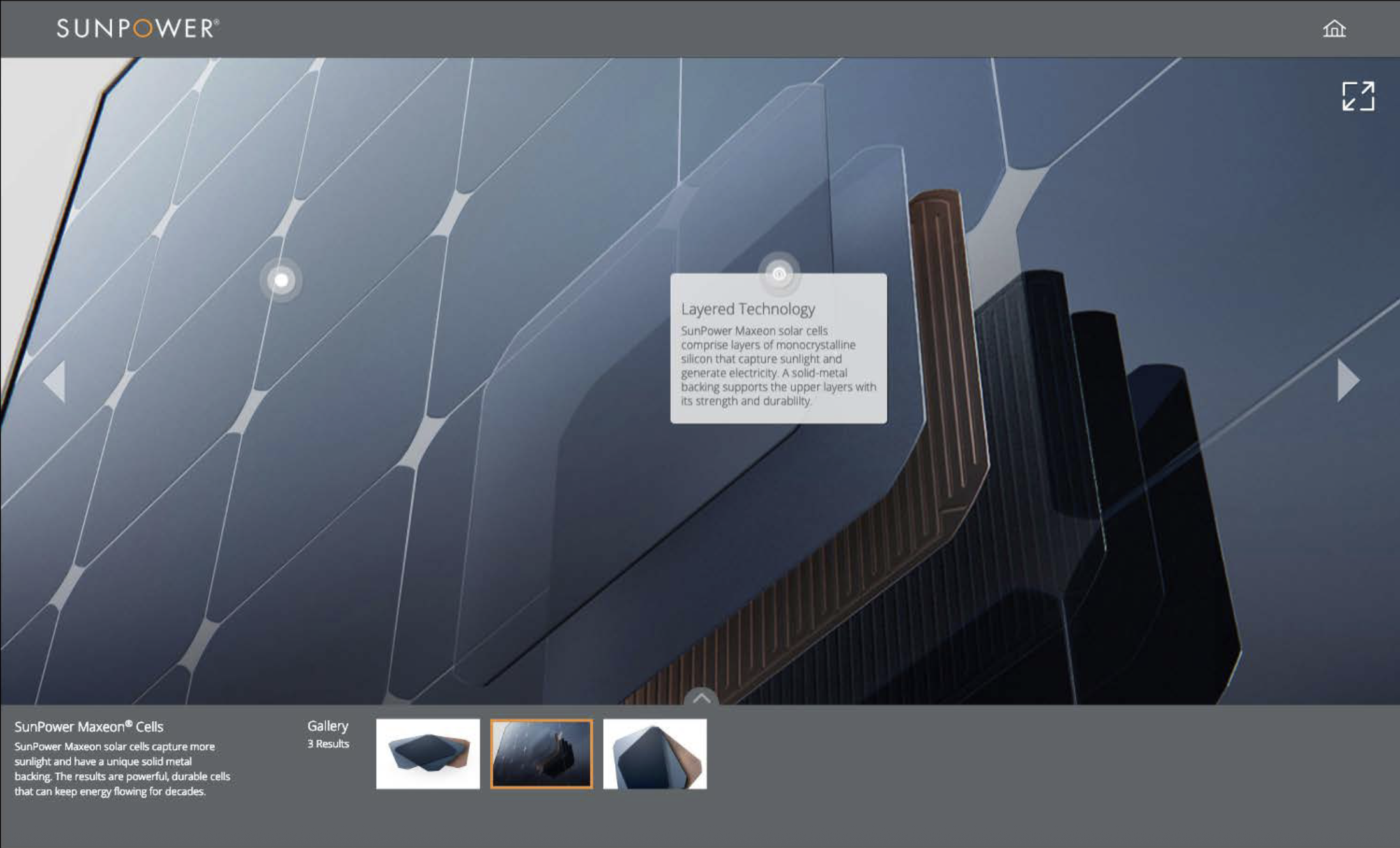
A simple efficiency story showed where and how performance pays off.
Customer and community videos shared installation experiences and results.
An installation eBook set expectations and eased process anxiety.
A glossy dealership look book captured the innovation and potential behind the product.

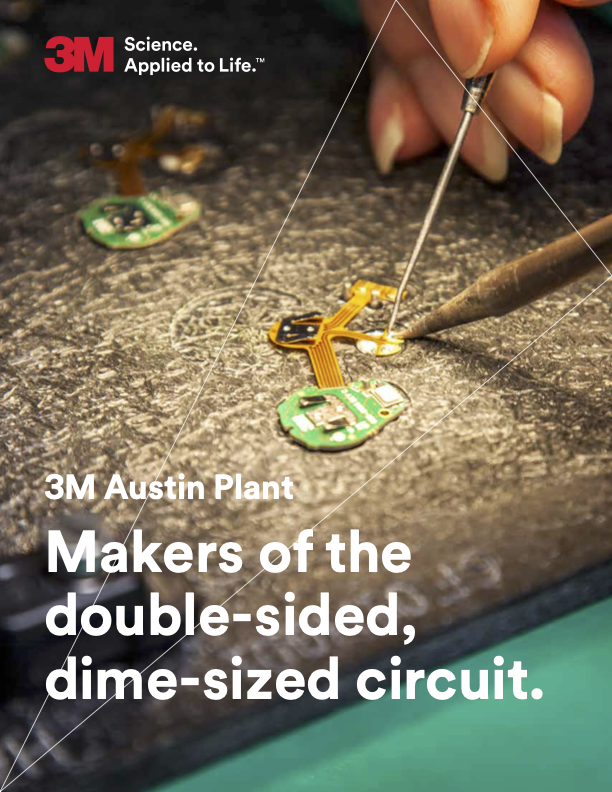
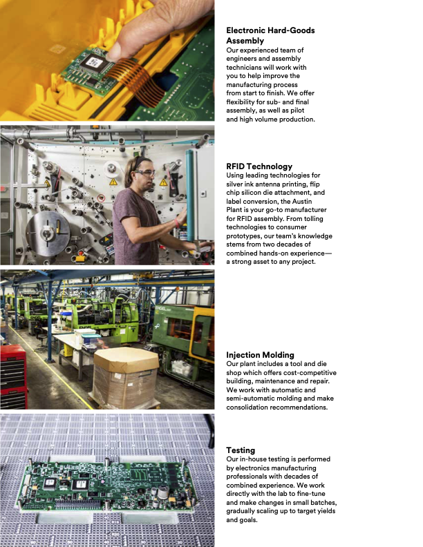
3M - Enterprise
Uniting a global giant under one voice and purpose.
3M
Enterprise brand voice rollout
Uniting a global giant under one voice and purpose.
In 2015, 3M launched its first rebrand in 30 years. With operations in 87 countries, 93,000 employees, and roughly 60,000 products, the rollout was massive. I worked to translate the new brand strategy into usable messaging keeping the story anchored to 3M’s evolved vision: science in service of real lives.
3M’s new brand reframed its mission around bettering people’s lives.

It celebrated the work employees bring into the world—seen and unseen.
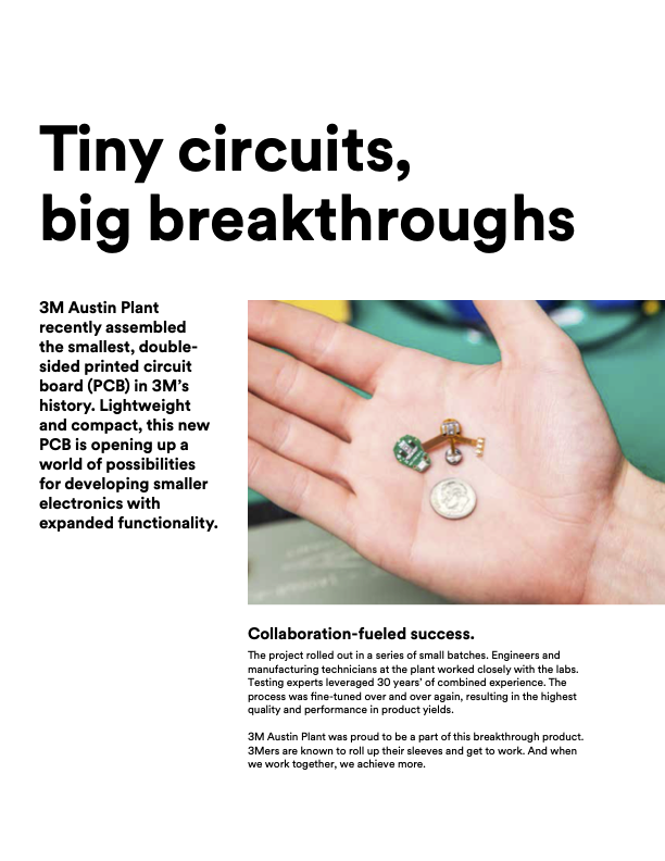
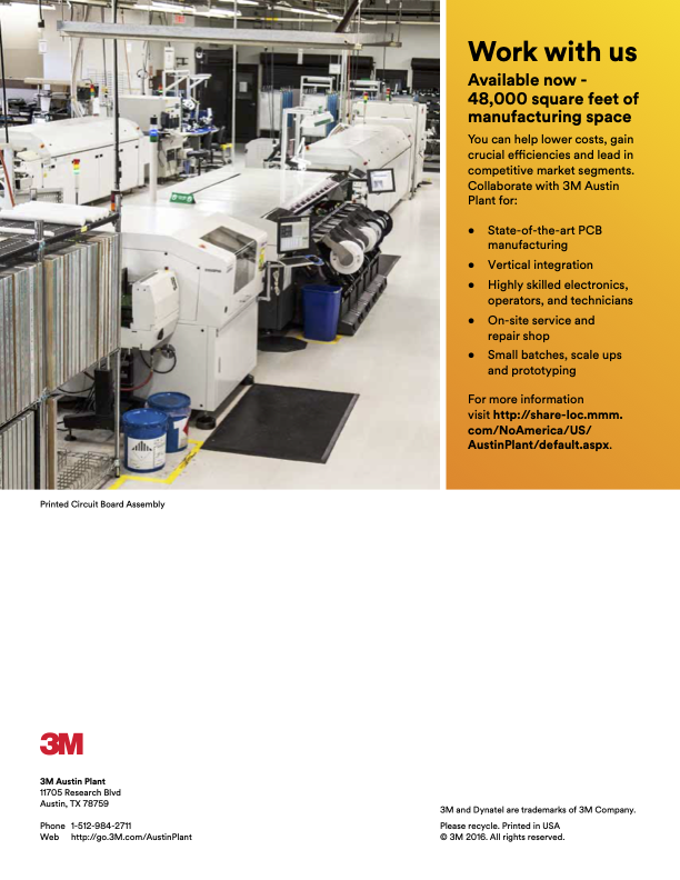
It made complex innovation easier to understand by grounding it in real outcomes.

It made 3M’s thought leadership easier to share, internally and externally.
And it brought the value of the small, often invisible components that power modern life into clearer view.
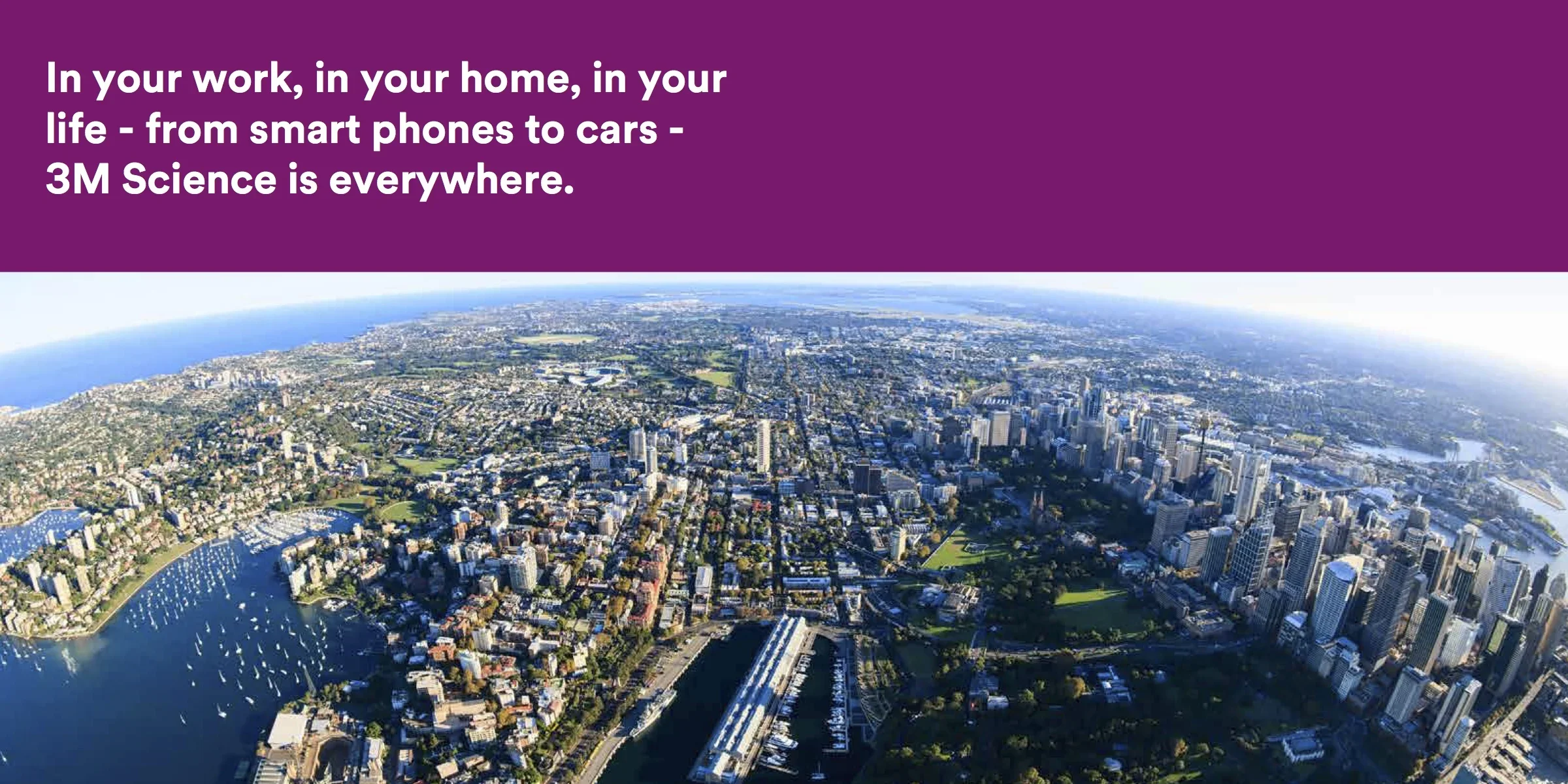
The rebrand needed more than a headline—it needed a repeatable narrative system. We built a message hierarchy and voice guidance that could travel across internal and external communications, then translated it into modular content teams could reuse: clear themes, proof points, and a consistent tone that made technical work feel human without losing accuracy. The result was a scalable framework that kept the brand coherent across divisions while making it easier for marketing, PR, advertising, and employee communications to tell the same story with clarity.